0 members and 533 guests
No Members online

» Site Navigation

» Stats
Members: 35,442
Threads: 103,075
Posts: 826,688
Top Poster: cc.RadillacVIII (7,429)
|
-
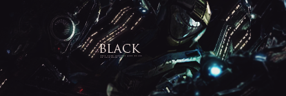
 New Style! New Style!
Okay, so this is my new style, i havent seen anything like it before so im kind of proud and i like the outcome. CnC please 
-
to much topaz :|
i like the smudge tho

Wrftw thanks for the awesome gift
-
Thats what the point is, imo the cartoon effect from the topaz goes really well with this tag, just personal preference though.
-
the whole sig is nice but the "overtopazing" removed the details of the sig it also removed the depth
 ^thanks for the epic gift AGITATOR!
-
to much topaz for my taste
-
I like the tag but it's definitely not a new style, maybe new for you.

 = Monroe Smith IV = Monroe Smith IV
 = skeetonbeezies = skeetonbeezies
-
the whole sig is nice but the "overtopazing"
Overcartooning lol
Anyway,I like the idea if the topaz was toned down a bit,it would've created the ilusion of green fire.
Don't get me wrong though,it's just a mater of brainstorming and twitching,I like idea of the project.
-
Dont head in this direction, soon you'll see that topaz does nothing but kill tags in the end.
It might be decent for certain things such as softening a tag really lightly but not something to go too far into.
-
lose that topaz m8 eww kiu tho u had a nice concept just yuck on topaz :P
-
The topaz ruined it, so much. Adding a filter to an applied image isn't a style.
Similar Threads
-
By Scrib in forum Sigs & Manips
Replies: 12
Last Post: 05-28-2009, 10:09 AM
-
By [PHXN] New001 in forum Sigs & Manips
Replies: 11
Last Post: 01-25-2007, 01:07 PM
-
By Chadwick in forum Sigs & Manips
Replies: 0
Last Post: 01-24-2007, 02:46 PM
-
By ep1c in forum Sigs & Manips
Replies: 4
Last Post: 01-23-2007, 01:14 AM
-
By PREDATOR. in forum Sigs & Manips
Replies: 6
Last Post: 06-12-2006, 10:41 PM
 Posting Permissions
- You may not post new threads
- You may not post replies
- You may not post attachments
- You may not edit your posts
-
Forum Rules
|


 Reply With Quote