0 members and 6,989 guests
No Members online

» Site Navigation
» Stats
Members: 35,442
Threads: 103,075
Posts: 826,688
Top Poster: cc.RadillacVIII (7,429)
|
-
AIDS Walk T Shirt
so my team had a tshirt design contest, and i lost (oh well) but i did get to help with the final product... only to realize that there's not enough time to get them printed (woopsies)
(now we're going to make a stencil of the winning design and spray paint it on the shirts... this is gonna be interesting...)
anyways so i'm gonna post both designs.
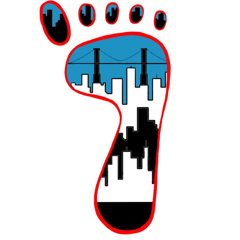
this is my design, the blue is our school's color (our team is school based) and the red is the AIDS Ribbon/AIDS Walk color.

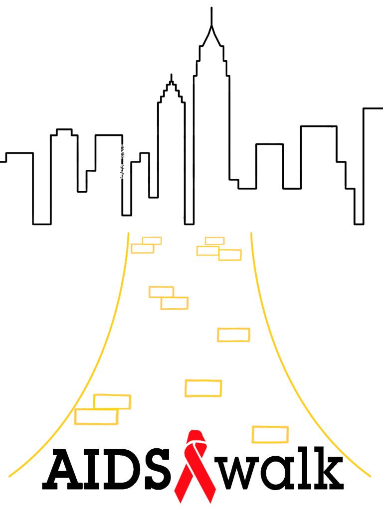
this is not my design, but it is the winning design. I didn't come up with the idea, i just put it on a computer so that they could send it in to be printed (which never happened...)
(ps: text on the other hand was completely my design and doing )
-
Nice designs. I would like to see them on a actual T-Shirt though.
 Originally Posted by Slave
takken, you sweet boy you, i could eat you 6^
-
meh... i made a template but i'm too lazy right now to upload it all..... >.>
-
I think what woulda been a much better design would have been your teams foot design and your text, the other design is honestly bland and doesn't really do it for me. Yours looks nice Panda Great job.
-
I agree. Why that was the winning piece I really can't say. Yours at the very least makes sense in regards to the purpose. The other one is just...huh?
I don't guess it matters, since it is just a tshirt design. But if I were to apply some brand methodology here, I would say that the overall image ought to provide some meaning, and be connected in some way to the project or thing it represents. Yours does this much more effectively than the other one.
-
personally... i just think the other one was chosen cause the other girl is more popular than i am... but idk
its supposed to be like the yellow brick road leading up to the city... cause its the new york aids walk... idk
i was pissed when i lost too, but i'm trying (very, very hard) to be a good sport about it >.>
-
 Originally Posted by gr4ph1kP4ND4
its supposed to be like the yellow brick road leading up to the city... cause its the new york aids walk... idk
Tell her she fails. And that's from me. :P
-
The thing that really bugs me on the second design is that they put their names in the buildings, it just doesn't look right to me ( and it's really annoying every time I notice it). As for the design overall it's a bit simplistic and quite clean. I prefer your design though, but the problems with your design ( in my opinion) is that the red lines aren't very neat and I don't like the wire part of the bridge XD. It's still the better one out of the two =d
-
i literally learned how to use the pen tool the DAY after i finished this design. so that means i literally drew every line, and not well, until the day after. from now on i'm all excited cause i know how to pen tool
-
so in the end, we didn't have time to order the T's, so i cut out a stencil of a ribbon and we spray painted the shirts then each designed/decorated the backs. so it turned out alright, we all looked great
Similar Threads
-
By gr4ph1kP4ND4 in forum News & Updates
Replies: 29
Last Post: 04-13-2011, 01:17 PM
-
By Dron in forum Sigs & Manips
Replies: 5
Last Post: 05-23-2010, 10:42 AM
-
By Firescorpio in forum Digital Art
Replies: 2
Last Post: 12-28-2008, 10:54 AM
-
By Krimsyn in forum Digital Art
Replies: 9
Last Post: 08-24-2005, 10:45 PM
-
By Red.Agony in forum Sigs & Manips
Replies: 18
Last Post: 06-24-2005, 11:39 AM
Posting Permissions
- You may not post new threads
- You may not post replies
- You may not post attachments
- You may not edit your posts
-
Forum Rules
|