0 members and 416 guests
No Members online

» Site Navigation

» Stats
Members: 35,442
Threads: 103,075
Posts: 826,688
Top Poster: cc.RadillacVIII (7,429)
|
-
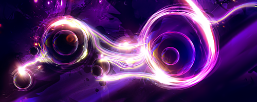
 Illidan Stormrage vs Arthas Menethil Illidan Stormrage vs Arthas Menethil

Trying different things again.
What do you think?
-
-
bro still looks like your other ones
It does look better than the others a bit because of better colours but other than that still almost the same
-
You are finally working with a concept, which is good.
I fancy the coordination of different effects within this piece.
The diversity of colors used within this piece is beautiful.
The text is very well done. In fact, your text work really increases the quality of the piece. It is good that you decided to set limitations on smudging. Remember, less is more.
Well done.

Ugh your signature is way too Micheal Bay'd
Visit my DeviantArt for more.
-
 Originally Posted by +Josh Fx

bro still looks like your other ones
It does look better than the others a bit because of better colours but other than that still almost the same
I will have to agree that it looks like your others in the since that the same smudge style is used. And its really noticeable because of the large dots around the render.
That said, if this was your first time posting on this site, I'd say its an extremely well executed smudge piece. What's different about this than other smudges I'd say is the color scheme is so vibrant and interesting. It's aesthetically pleasing. The depth is nice too. Nice work.
-
10x all,I will improve 
the same smudge style is used. And its really noticeable because of the large dots around the render.
It was clipping mas :P but hey at least it will be known who made it lol 
-
It's quite nice but the problem here is the color tone, lighting, blending and contrast.
I don't like the green color tone you went for here, I believe a quick color balance would fix that up though  . .
The lighting is there but imo it needs to be emphasized more and have a better appeal. Try add a few small FX to that area.
The contrast and brightness should both be lowered a bit.
The blending. It just seems overblended . I don't think you can do anything about that now but just a tip for next time .
Just a few small adjustments, that's all. Kiu.
-
You should make a text tutorial because your text is boss
-
nice work dude. i like it
only improve the lightning
Similar Threads
-
By Downfall in forum Sigs & Manips
Replies: 4
Last Post: 11-20-2010, 10:21 AM
-
By cs4pro in forum Resources
Replies: 6
Last Post: 10-07-2010, 08:06 PM
-
By cs4pro in forum Sigs & Manips
Replies: 4
Last Post: 09-27-2010, 11:17 AM
-
By cC.Dispeller in forum Sigs & Manips
Replies: 3
Last Post: 09-01-2010, 01:48 PM
-
By schultz in forum Sigs & Manips
Replies: 1
Last Post: 01-24-2010, 06:52 PM
 Posting Permissions
- You may not post new threads
- You may not post replies
- You may not post attachments
- You may not edit your posts
-
Forum Rules
|


 Reply With Quote