GFXVoid Graphic Design Forum

Remove Text Formatting
Loading...

» Online Users: 10,812

0 members and 10,812 guests
No Members online

» Site Navigation

 > FAQ

» Stats

Members: 35,442
Threads: 103,075
Posts: 826,688
Top Poster: cc.RadillacVIII (7,429)
Welcome to our newest member, Lekelindids
Results 1 to 6 of 6
  1. #1
    Join Date
    Jun 2011
    Location
    Seville, Spain
    Posts
    12

    Default Stupidness is getting here <3


    Hope u like them >.<

  2. #2
    Join Date
    Jun 2010
    Location
    Under your bed
    Posts
    3,385

    Default

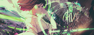
    i like the first one but the render is too washed out, 2nd one the text is too distracting and the tag is undercontrasted/ washed out

  3. #3
    Join Date
    Jun 2011
    Location
    Seville, Spain
    Posts
    12

    Default

    In the second one, the undercontrasted effect it's the effect I wanted to give to the tag :P

    Thanks for the comment :>


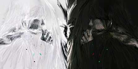
    The Light vs The Darkness.

  4. #4
    Join Date
    Mar 2010
    Location
    U.S
    Posts
    1,509

    Default

    First one is awesome, love the colors and style, could use some adjustments with the lighting and a tad more depth but sick creativity
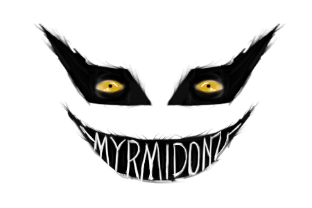
    M y r m i d o n s
    Midnight Marauders
    Plagues
    Kryptic Visons

    KOTH 19winStreak


  5. #5

    Default

    compo looks good on both
    but they seem to be wash out


    ^thanks for the epic gift AGITATOR!

    SOTW:261|265|288|308 |edwinpabito.deviantart.com


  6. #6
    Join Date
    May 2011
    Location
    IL
    Posts
    9

    Default

    Quote Originally Posted by edwinpabito View Post
    compo looks good on both
    but they seem to be wash out
    i agree , the first doesnt look too washed out but could use a little more sat or vibrancy

Posting Permissions

  • You may not post new threads
  • You may not post replies
  • You may not post attachments
  • You may not edit your posts
  •  
Powered by vBadvanced CMPS v4.1.1