0 members and 998 guests
No Members online

» Site Navigation

» Stats
Members: 35,442
Threads: 103,075
Posts: 826,688
Top Poster: cc.RadillacVIII (7,429)
|
-
 Indie Chick and Gift CnC thread Indie Chick and Gift CnC thread
First time doing that smudge style
Plus through in some of other shiz
And my gift for Kinetics
Gift Thread can be found here:

-
Woah seccond one <3
reminds me a bit of liquids style
I just love the color's in that one 
first one is nice to, but there are like some sort of triangles in there..
If you delete those, than i think its awsome 
-
haha thanks Gaaf XD
I like the Kinetics gift one too.
Colours was what I really focused on so glad to see it paid off
The first one does have 2 triangles in it XD
Well just one and another one happened when I duplicated my signature for the left hand side :P.
Triangles were there to enforce the concept of the indie look :P
I'll make another version with out them though
Thanks for that mate!
-
-
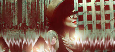
Yes, the smudge of the first one looks major detail. I believe you didn't many adjustments to it and therefore it looks flat  . .
The second one has good composition but it's your color of the effects that are bringing it down.
They're mainly one tone of colors, cyan and magenta and therefore they flatten out the tag. There should be a lighter tone within the fractal so it pops.
I believe you went to Hue & Saturation > Colorize? Yes, well that mainly preserves the luminosity and makes it one color. Avoid using colorize and try to pick the closest colored fractal you can get.
Kiu!
-
-
what i like about the first one is looks kinda like an old picture to make it look more like that style could put some burn marks or something on it for texture. just a thought;
i also agree above ,these guys are right a nice small dusting of sharpening will look good i think m8 maybe making one showing us the changes u made can cnc more.
the 2nd tag i really like the colors u have used i think they work well together.
what i think can be fixed maybe is the text i don't think that box under your text is needed it pulls my eyes attention to the text more then your focal . depth could use a little bit more too could dry the burn and dodge tool but other then that bro u got nice styles here so kiu . like to see more from you.
-
 Originally Posted by Ishamz

first one the smudge is kind of blurry it doesnt look too good
better sharpen it
the soft brushing isnt really appealing either,
depth is okay and lightning too
second one is better
the text has to go NOW tho lol. or change the font or something.
the left is a bit empty, be careful with the softbrushing again, it looks bad
not bad tho
thanks mate
Text isn't going though
I'm aware it doesn't look good but it's for a gift so adds a more personal touch to it
Originally Posted by Teletubby
Yes, the smudge of the first one looks major detail. I believe you didn't many adjustments to it and therefore it looks flat .
The second one has good composition but it's your color of the effects that are bringing it down.
They're mainly one tone of colors, cyan and magenta and therefore they flatten out the tag. There should be a lighter tone within the fractal so it pops.
I believe you went to Hue & Saturation > Colorize? Yes, well that mainly preserves the luminosity and makes it one color. Avoid using colorize and try to pick the closest colored fractal you can get.
Kiu!
na I don't use colourise
Just Hue/Sat though
thanks for the comment
Originally Posted by .Griever
sharpen the smudge
thanks :l
Originally Posted by sirenzo
what i like about the first one is looks kinda like an old picture to make it look more like that style could put some burn marks or something on it for texture. just a thought;
i also agree above ,these guys are right a nice small dusting of sharpening will look good i think m8 maybe making one showing us the changes u made can cnc more.
the 2nd tag i really like the colors u have used i think they work well together.
what i think can be fixed maybe is the text i don't think that box under your text is needed it pulls my eyes attention to the text more then your focal . depth could use a little bit more too could dry the burn and dodge tool but other then that bro u got nice styles here so kiu . like to see more from you.
yeah bro thanks
Text is once again only because it's a gift. I'd rather not add text but hey it adds something a bit more personal :S
Similar Threads
-
By +Josh Fx in forum Sigs & Manips
Replies: 4
Last Post: 05-28-2011, 07:13 PM
-
By spooner in forum Sigs & Manips
Replies: 5
Last Post: 02-16-2009, 09:20 PM
-
By Henry in forum The Void
Replies: 25
Last Post: 10-03-2006, 03:28 PM
-
By Magnum in forum The Void
Replies: 4
Last Post: 06-13-2005, 01:22 PM
 Posting Permissions
- You may not post new threads
- You may not post replies
- You may not post attachments
- You may not edit your posts
-
Forum Rules
|


 Reply With Quote