0 members and 726 guests
No Members online

» Site Navigation

» Stats
Members: 35,442
Threads: 103,075
Posts: 826,688
Top Poster: cc.RadillacVIII (7,429)
|
-
 Soldier tagg Cnc Soldier tagg Cnc
a new tagg by me:

Cnc plz :P
First SOTW win (301)

Gift from my secret backup santa Oath ^ <3
Gifts <-- clickie
-
0.0 20 views, 0 comments?
First SOTW win (301)
Gift from my secret backup santa Oath ^ <3
Gifts <-- clickie
-
-
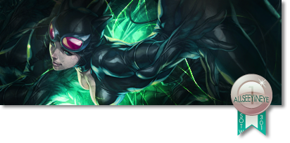
burn the around the soldier to add depth and sharpen him up and i think that would improve this tag alot good start though m8
-
CnC
 Originally Posted by Allseeyineye

Pretty good flow so you have a good concept going on, left lighting coming up and being faded by his shadow but you lacked execution.
To start it I would say make those two black empty corners either completely disappear or soften them up a bit. They don't match your tag at all and I think it's killing the impact of it.
You worked well with your fractals, nothing about about them at all except your text. Your text look like they need to either be removed or changed since they don't really go with the render at all.
The tag overall looks monotoned. There is no color variety and it all just seems yellow and brown with a bit of gray. Try using some gradient maps to adjust some colors and maybe some gradient maps set on luminosity to add difference and clear up the shadows which brings us to-
-use the burn/dodge tool to increase the lighting. The spots near the fractal should be lighter than the sides that are not being touched by it. For example the right side of the face should be a bit dark because the lighting if coming from the left, then around his shoulder there should be some shadowing as well because the shoulder bad would create a small shadow.
Good luck, kiu
-
Originally Posted by Syn
Pretty good flow so you have a good concept going on, left lighting coming up and being faded by his shadow but you lacked execution.
To start it I would say make those two black empty corners either completely disappear or soften them up a bit. They don't match your tag at all and I think it's killing the impact of it.
You worked well with your fractals, nothing about about them at all except your text. Your text look like they need to either be removed or changed since they don't really go with the render at all.
The tag overall looks monotoned. There is no color variety and it all just seems yellow and brown with a bit of gray. Try using some gradient maps to adjust some colors and maybe some gradient maps set on luminosity to add difference and clear up the shadows which brings us to-
-use the burn/dodge tool to increase the lighting. The spots near the fractal should be lighter than the sides that are not being touched by it. For example the right side of the face should be a bit dark because the lighting if coming from the left, then around his shoulder there should be some shadowing as well because the shoulder bad would create a small shadow.
Good luck, kiu
hmm okay, thx very much 
First SOTW win (301)
Gift from my secret backup santa Oath ^ <3
Gifts <-- clickie
-
add a complimentary colour, like a darkish red. That'd help it out a lit.
Drop the text, it's not helping it in any way..
Sharpen up the render. It's blurred and hence loses detailing.
The black space shouldnt be black. It should be a darker form of your stock background. (light spreads it isnt just cut off completely)
The fractal/C4d is nice, but hard to recognize because its all monotone..
Dodge and burn for better lighting and depth.
apply image. smudge. erase, set to lighten. add more flow. get it looking secksy.
Similar Threads
-
By Linda in forum Sigs & Manips
Replies: 14
Last Post: 11-06-2010, 12:04 PM
-
By david5254 in forum Sigs & Manips
Replies: 4
Last Post: 08-22-2010, 03:37 PM
-
By david5254 in forum Sigs & Manips
Replies: 1
Last Post: 08-14-2010, 06:12 PM
-
By david5254 in forum Sigs & Manips
Replies: 3
Last Post: 07-28-2010, 02:10 PM
-
By Wizdum in forum Sigs & Manips
Replies: 7
Last Post: 07-18-2010, 06:57 AM
 Posting Permissions
- You may not post new threads
- You may not post replies
- You may not post attachments
- You may not edit your posts
-
Forum Rules
|


 Reply With Quote