GFXVoid Graphic Design Forum

Remove Text Formatting
Loading...

» Online Users: 26,370

0 members and 26,370 guests
No Members online

» Site Navigation

 > FAQ

» Stats

Members: 35,442
Threads: 103,075
Posts: 826,688
Top Poster: cc.RadillacVIII (7,429)
Welcome to our newest member, Lekelindids
Results 1 to 7 of 7

Thread: "Look Here"

  1. #1

    Default "Look Here"

    i just dno about this one... i put a lot of work into it... but just not sure of the outcome


    Thanks RememberMe <3 WOOT

    awesome gift from G.. Thx so much


  2. #2

    Default


    Thanks RememberMe <3 WOOT

    awesome gift from G.. Thx so much


  3. #3
    Join Date
    Jul 2011
    Posts
    17

    Default

    I definitely like the style. First one's my preference. Maybe add a lil over on the left and brighten a bit more where the light bulb is. good job


  4. #4
    Join Date
    May 2011
    Location
    In the Trap
    Posts
    197

    Default

    Holy crap this first one is epic I love the colors but I dont like that the light ends after the curve you should have the light extend to the end of the sig and burn the corners

    or
    use a black to transparent gradient put it in the corners on a different layer like this 
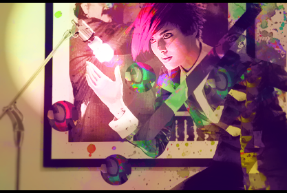
then set the layer mode to soft light or overlay and mess with the opacity

    also theres a piece of C4d on her face (sorry for being pick)


  5. #5

    Default

    Your not picky I appreciate it!!! I agree the light source needs to be more dramatic in the way that it stretches... teh left is a wee boring... i was worried about clutter :/ The line on her face is actually from the stock tho... In face there is only one c4d in this image and it is right by the lighting 
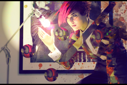
just a bubble to give it a pinkish glow ")

    Thanks for comments everyone I will open this up later and play with all ur suggestions and see what I come up with!


    Thanks RememberMe <3 WOOT

    awesome gift from G.. Thx so much


  6. #6
    Join Date
    Jun 2011
    Location
    Canada
    Posts
    279

    Default

    The colours need work, they just dont seem to match up. Can I see a B&W V for fun?
    Proud owner of the "50 Shades of Syn" series


  7. #7
    Join Date
    Dec 2006
    Posts
    5,223

    Default

    its a nice concept and idea in this tag but my only problem with it is i think would look best if u crop it down some i think u made it look too plain in some areas if was croped up would look better imo, when it was loading up for me i first saw just half of it and it looked pretty good, but when it continued to load it just didn't feel same as i thought at first just an idea gj tho .


Similar Threads

  1. "Toy Story's" Alien of Pizza Planet By Kodey Bell
    By Fur in forum Treasured Artworks
    Replies: 8
    Last Post: 01-05-2011, 04:15 PM
  2. "George Bush doesn't care about Black People."
    By Shamino in forum The Void
    Replies: 13
    Last Post: 12-19-2008, 07:50 PM
  3. Replies: 4
    Last Post: 11-25-2008, 06:36 PM
  4. Replies: 2
    Last Post: 03-26-2008, 11:56 AM
  5. <("<)<(")>(>")>Cubez<("<)<(")>(>")>
    By Morphius in forum Digital Art
    Replies: 18
    Last Post: 04-29-2005, 07:13 PM

Posting Permissions

  • You may not post new threads
  • You may not post replies
  • You may not post attachments
  • You may not edit your posts
  •  
Powered by vBadvanced CMPS v4.1.1