0 members and 764 guests
No Members online

» Site Navigation

» Stats

Members: 35,442
Threads: 103,075
Posts: 826,688
Top Poster: cc.RadillacVIII (7,429)
|
-
 Comeback Comeback
Yes I've been told I've been making absolute shit for the past few weeks
I'd like to think I'm back on track with GFX
Revisited my old style a bit but didn't do it the exact same.
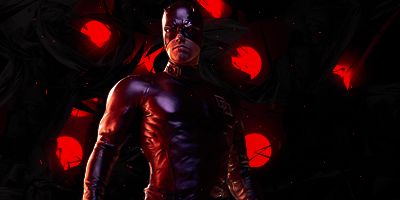
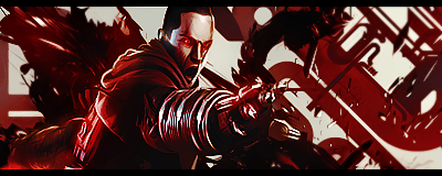
Personally I see that I screwed up with the big dot right to the right of daredevil. Too much is visible and it looks awkward.
I'll have to fix that
And for some reason the colours I see on my photoshop computer is strange when I see on my other computers. I think the colour settings are screwed up
They looked a lot better on my other computer
The red looks really bad and nowhere near the colour it looked like on my other computer.. wtf
-

Well I think it has a lot of potential. The render needs to blend into the background more so I suggest you add something like a C4D there and blend it. Also, the red dots are way to distracting. I think you could use a 80 pixel soft brush and brush over them on screen. It'll make your lighting better too. Other than that I think you've done a nice job.
About the colour thing- You may have the CMYK settings on. You need RGB. Hold Ctrl, Alt and Y to take this off, or go in your windows panel.
-

I agree with ShorterGFX. The blending of the render and dulling down a bit own the red circles are all I see needs fixing. Other than that great job, looks like it will be really good.
-

Thanks heaps Shorter
I think that the blending got messed up a bit with the render. Had some natural white-yellow lighting on it
I'll try the screen thing too
Thanks a lot for the tip I'll see if it works
-

i think it just needs more... and then it will be complete  I like what u have so far that is for sure I like what u have so far that is for sure 
-

I only think that it is a bit to dark, becouse i can barely see the contrast of the c4d atm,
I also think that the lightning is a bit off, becouse therre is no withe light source for the reflection on him
I like evrything else, GJ josh 
-

Thanks guys
Ascheb what do you mean by more. Can you give me some suggestions or examples??
And thanks Gaaf
This was actually a request and they wanted it dark. Pretty much just red and black :L
-

I'm digging your style but it's just not executed as well here as I've seen from you in the past.
The c4d's used here are so dark that you can barely make out any shapes unlike the awesome soul eater one your in signature at the moment. This means that all that's left are some glowing orbs and a render. There's a lot of lighting present on the render that doesn't seem to have a source in the arm/shoulder and head area.
I suggest you try and blend in the daredevil a bit and make the light from the orbs visible on him or make them act as a source for the lighting allready present. Perhaps lighten it up a bit but as you mentioned its a request and they wanted it dark. Keep it up!
-

Seams incomplete mind if i collab on it mate?
-

It has potential, but it is a bit too dark so it's hard to notice the C4D details in it. In all honestly, using pure red like that isn't a good idea, it's a hard color to work with and pure red is even harder. Try to do lighter toning of red, that would look better.
Nice piece, kiu!
Similar Threads
-
By cc.mio in forum Sigs & Manips
Replies: 7
Last Post: 04-24-2010, 08:39 AM
-
By Kotora in forum Sigs & Manips
Replies: 10
Last Post: 04-05-2010, 04:59 PM
-
By catch. in forum Sigs & Manips
Replies: 2
Last Post: 02-16-2009, 02:06 PM
-
By Smiling Demon in forum Sigs & Manips
Replies: 6
Last Post: 10-20-2007, 06:08 AM
-
By 3rdtech in forum The Void
Replies: 35
Last Post: 05-24-2005, 01:23 AM
 Posting Permissions
- You may not post new threads
- You may not post replies
- You may not post attachments
- You may not edit your posts
-
Forum Rules
|


 Reply With Quote



 I like what u have so far that is for sure
