0 members and 1,354 guests
No Members online

» Site Navigation

» Stats
Members: 35,442
Threads: 103,075
Posts: 826,688
Top Poster: cc.RadillacVIII (7,429)
|
-
 A-Creed A-Creed
New one D8
-
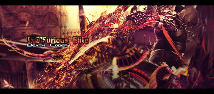
It took me a good minute to finally make out what was going on in the sig. The effects are pretty hectic and just overpowers the render. The lighting seems pretty wierd and the text itself is pretty bad, im not the best person to be giving advice on text but its just seems extremely out of place and adding the outline to make the text noticeable makes it worse. And the colors could be better imo.
Not saying that this is terrible just that many things need to be reconsidered because I see the direction you were going with on this piece but more work needs to be done. Try to focus on the basics more and this sig would be alot better than what is here. Again this is just my opinion.

My Three Rules Of Making a Sig Flow, Lighting and Depth
-
I almost entirely agree with the person above me. Text is a hard concept to grasp and some pieces don't even need text. Until you start to fully understand the basics, try to avoid text. Also, It is a little chaotic, and you lost your focal point in there. I finally found your person, but I am guessing this was a stock? If it wasn't I would try bringing your render up, and in front of all your'e effects. If you do that, your focal will be so much better and you can make it look like he is jumping and the effects are coming from him as he is falling - kind of like wind. Overall I like the concept, but don't think it was properly executed. I don't think you should give up on this piece, so KIU and post a v2
 Originally Posted by JDdesign
Trying to be different by makin a sig with puke ugly colors doesn't make u a new breed; it just makes u color blind 
Originally Posted by Syn
No problem my man, helping others is how I make up for masturbating to tranny porn. Makes me feel a bit less gay.
-
Ye that amount of c4d's on a stock isn't the best idea maybe, you gotta look carefully to actually see Altaïr/Ezio.
I like the color theme on the stock, looking forward to a V2! 
Similar Threads
-
By bigbase in forum Sigs & Manips
Replies: 0
Last Post: 12-25-2010, 10:16 AM
-
By Xelo in forum Sigs & Manips
Replies: 0
Last Post: 12-13-2010, 12:54 AM
-
By Bluiceflamez in forum Sigs & Manips
Replies: 6
Last Post: 05-02-2009, 09:29 AM
-
By Harlequin_ in forum Sigs & Manips
Replies: 3
Last Post: 07-26-2008, 06:13 PM
-
By Firescorpio in forum Sigs & Manips
Replies: 6
Last Post: 06-13-2008, 04:58 PM
 Posting Permissions
- You may not post new threads
- You may not post replies
- You may not post attachments
- You may not edit your posts
-
Forum Rules
|


 Reply With Quote


