GFXVoid Graphic Design Forum

Remove Text Formatting
Loading...

» Online Users: 11,664

0 members and 11,664 guests
No Members online

» Site Navigation

 > FAQ

» Stats

Members: 35,442
Threads: 103,075
Posts: 826,688
Top Poster: cc.RadillacVIII (7,429)
Welcome to our newest member, Lekelindids
Results 1 to 3 of 3

Thread: Eh!

  1. #1
    Join Date
    Jun 2011
    Posts
    24

    Default Eh!


    I don't know how I feel about this one.
    CnC
    Last edited by JosephWalker; 08-11-2011 at 06:30 PM.

  2. #2
    Join Date
    Aug 2011
    Posts
    242

    Default

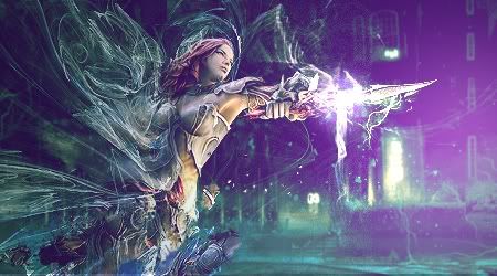
    Left side to right side is much too big a contrast. Leave the lighting on the thing she's holding but get rid of the purple lighting next to it. I'd also crop ~50 pixels off the top and lighten the render's face a bit to draw the eye to it.
    My favorite work of mine:


    SOTW stats: Entries: 2 Wins: 0 Second place: 0 Top 3: 0 Top 5: 1

  3. #3
    Join Date
    Jul 2010
    Posts
    1,558

    Default

    Good concept, you lacked a bit of execution though. Lighting could also use some work and the fractals can be distinguished a bit more.


Posting Permissions

  • You may not post new threads
  • You may not post replies
  • You may not post attachments
  • You may not edit your posts
  •  
Powered by vBadvanced CMPS v4.1.1