GFXVoid Graphic Design Forum

Remove Text Formatting
Loading...

» Online Users: 14,345

0 members and 14,345 guests
No Members online

» Site Navigation

 > FAQ

» Stats

Members: 35,442
Threads: 103,075
Posts: 826,688
Top Poster: cc.RadillacVIII (7,429)
Welcome to our newest member, Lekelindids
Results 1 to 4 of 4
  1. #1
    Join Date
    Aug 2011
    Location
    The Netherlands
    Posts
    11

    Default i need C&C more C&Cs :D


  2. #2
    Join Date
    Aug 2011
    Posts
    242

    Default

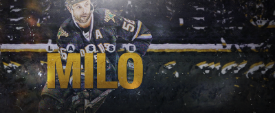
    I like it. But, I think it'd look better if the green parts were more vivid.
    My favorite work of mine:


    SOTW stats: Entries: 2 Wins: 0 Second place: 0 Top 3: 0 Top 5: 1

  3. #3
    Join Date
    Jun 2010
    Location
    netherlands
    Posts
    861

  4. #4
    Join Date
    May 2005
    Location
    New York, USA
    Posts
    1,148

    Default

    I like the fact that you added more color to this one. It's good but maybe a change of saturation on the background and green would be better - not sure but try it out and see what you get. Good work.

Posting Permissions

  • You may not post new threads
  • You may not post replies
  • You may not post attachments
  • You may not edit your posts
  •  
Powered by vBadvanced CMPS v4.1.1