0 members and 2,935 guests
No Members online

» Site Navigation

» Stats
Members: 35,442
Threads: 103,075
Posts: 826,688
Top Poster: cc.RadillacVIII (7,429)
|
-
-

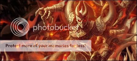
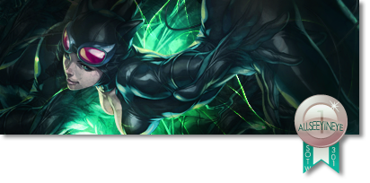
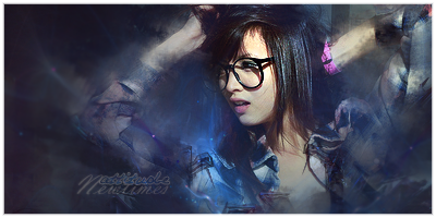
Hmm, I like the last one the most, but lets cnc them all 
1st:
Doesn't look that bad, but it seems unfinished. you've got things like focal done, but it just need some standing out effects (I''d reccomend fractals, or a light orb with soft brush)
2end:
Looks simple, yet nice. the flow is good, but I feel there should be more going on in the background. maybe try closing her/him in with some c4d's?
3d:
The right part looks really good, but the left part looks washed out. fix the left part, and you've got a really nice tagg bro 
4th
I like this one, I don't really have remarks, other than it doesn't have text
you've got nice pieces there, but some just need a little more work
First SOTW win (301)

Gift from my secret backup santa Oath ^ <3
Gifts <-- clickie
-
1st kinda looks messy with the smudge nd txt doesnt seem to go good with it
2nd seems to plain
3rd its good the render seems a lil off from the rest of the sig, like it blends but it doesnt
4th seems pretty good, lighting flow nd depth, think the sharp on the render could be down jst a lil bit tho
kiu
-
-
#1 her arms are too blended.
#2 Cliché and the flow is too straight.
#3 very empty left side
#4 its too dark
-
Im gonna comment on the last one becouse that one has the most potential.
Its good but to dark, try to be creative with your render placement. Also the space stoch u placed on her looks lq and to blurry, might wanna fix that 
Lightning is pritty good , keep it up man
-
-
 Originally Posted by Gaaf

Im gonna comment on the last one because that one has the most potential.
Its good but to dark, try to be creative with your render placement. Also the space stock u placed on her looks lq and to blurry, might wanna fix that
Lightning is pretty good , keep it up man
agree with gaaf on this the othe2 look unfinished . the last one cought my eye the most looks like u had a great start but u gave up on it like throw in a few c4ds on top and called it good well now you need work on the lighting of this tag and maybe toss in some gradients for color gl m8 .
-
Originally Posted by sirenzo
agree with gaaf on this the othe2 look unfinished . the last one cought my eye the most looks like u had a great start but u gave up on it like throw in a few c4ds on top and called it good well now you need work on the lighting of this tag and maybe toss in some gradients for color gl m8 .
thanks 
  <3ty ase
Similar Threads
-
By Fork in forum Sigs & Manips
Replies: 9
Last Post: 06-06-2011, 02:27 PM
-
By schultz in forum Sigs & Manips
Replies: 9
Last Post: 05-23-2011, 06:07 PM
-
By 0nc3w4s in forum Sigs & Manips
Replies: 8
Last Post: 02-23-2011, 04:42 AM
-
By Luizfe in forum Sigs & Manips
Replies: 1
Last Post: 11-10-2009, 04:31 PM
 Posting Permissions
- You may not post new threads
- You may not post replies
- You may not post attachments
- You may not edit your posts
-
Forum Rules
|


 Reply With Quote