0 members and 622 guests
No Members online

» Site Navigation

» Stats

Members: 35,442
Threads: 103,075
Posts: 826,688
Top Poster: cc.RadillacVIII (7,429)
|
-
 Mass Effect Mass Effect
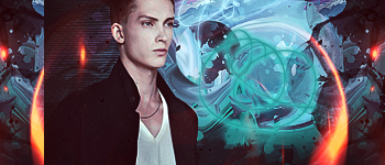
Well another tag after coming back into the game!
The house one turned out... pretty bad.. So I worked on colour blending, lighting etc! So hope this turned out better :P

-
-

The red is a little over powering. I'd personally turn it down a little.
-

It looks like most of your other signatures, so there really isn't much CnC that can be given that you haven't heard before, my suggestion is try switching it up with your style, fractal spamming is nice but it's worn it's self out, try something unique.
-

I think it's an improvement from your previous tags, at least.
-

Looks good dude. Might just be me but i struggled to spot the focal point immediately. Maybe tone up the main render slightly but im not great at making them so hey 
-

 Originally Posted by Allseeyineye

Wow, same kind of inspiration? this gifty i made for silent assasin a few days ago:

well, I like it man, red dots are a bit weird and the render could be blended a bit more
but it looks good man, Kiu 
haha yeah the only decent render I had left that is unused XD! I need some more aha
Thanks for the advice XD
 Originally Posted by Lewk

The red is a little over powering. I'd personally turn it down a little.
haha yeah I see. I overdid it a bit with the hue/saturation and selective colour layers XD
 Originally Posted by Fork

It looks like most of your other signatures, so there really isn't much CnC that can be given that you haven't heard before, my suggestion is try switching it up with your style, fractal spamming is nice but it's worn it's self out, try something unique.
Thanks man
I try to experiment with other styles but it doesn't turn out so well and in the end I always seem to revert back to this style :S
I plan on getting a whole heap of new resources and try something with them
Thanks!
 Originally Posted by JoShO

I think it's an improvement from your previous tags, at least.
Thanks I guess :P
 Originally Posted by midgetboytom

Looks good dude. Might just be me but i struggled to spot the focal point immediately. Maybe tone up the main render slightly but im not great at making them so hey 
haha I guess that's the problem with using the render as the bg as well XD
Thanks for the suggestion!
Thanks everyone for the CnC so far!
-

Tips on lighting/blending like wut wr said to you before.
Steps on easy lighting: new layer>fill it with black>set layer on linear light>soft brush>lower fill and the opacity if necessary.
Steps on easy blending: gradient map>choose any color you like>play with the layer options till you get the outcome you like>lower fill and the opacity if necessary.
I see growth in you and i wan't you to keep on experimenting until you get the effective outcome you wan't and that kind of style your working on. AND TBH RESEARCH ON PSD'S NOT TUTORIALS. tutorials are a waste seriously. :3
write me an epic ftw!!!!!
 I
I is feeling soo enthusia shamz

 ^THE SH#T^
-

Yeah Andoy I've started using PSD's haha
I'm a visual learner so I like seeing exactly what they did on that layer, this layer etc
But before my internet was shit so I couldn't download to much.. now it's a lot better haha! Any good psd packs you recommend?
Thanks for the tips! I'll try that lighting technique. Normally I just use a soft brush on linear dodge but I'm intrigued by this technique XD
-

Good stuff btw long time no talk.
Similar Threads
-
By Derosion in forum Sigs & Manips
Replies: 7
Last Post: 04-18-2011, 02:14 AM
-
By Derosion in forum Sigs & Manips
Replies: 0
Last Post: 04-14-2011, 02:18 PM
-
By Downfall in forum Sigs & Manips
Replies: 5
Last Post: 03-14-2011, 02:46 PM
-
By BigCookies in forum Sigs & Manips
Replies: 2
Last Post: 02-08-2011, 08:15 PM
-
By shiv96 in forum Sigs & Manips
Replies: 0
Last Post: 01-20-2010, 05:31 PM
 Posting Permissions
- You may not post new threads
- You may not post replies
- You may not post attachments
- You may not edit your posts
-
Forum Rules
|


