0 members and 391 guests
No Members online

» Site Navigation

» Stats
Members: 35,442
Threads: 103,075
Posts: 826,688
Top Poster: cc.RadillacVIII (7,429)
|
-
-

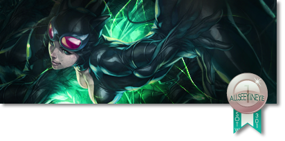
Sorry bro, but I really don't like this:
it seems you have just threw some space stocks/nebula's on there on color dodge. also, the blue thing on the right down side looks really LQ
the render has a weird head (long), but that might just be the render itself
you have probably lost your touch a bit, but if you keep working, I'm sure it comes back 
First SOTW win (301)

Gift from my secret backup santa Oath ^ <3
Gifts <-- clickie
-
Well I'm quite the contrary tbh I think its nice but a bit more could be done to it, I do agree with the comment above though, it does feel like a few resources have been slapped on and theres quite a bit of empty space you could add more to.
I don't think its terribly bad, just a bit unfinished.

One of the sexiest tags I've ever seen, from Radillac ↓ <3
-
-
I would say give it another shot starting over, go for a different style than putting a background stock in.
I think its quite a good render to use though, I imagine with a good few C4Ds it could look the part.
One of the sexiest tags I've ever seen, from Radillac ↓ <3
Similar Threads
-
By cc.mio in forum Sigs & Manips
Replies: 11
Last Post: 01-02-2011, 09:46 AM
-
By SunPower in forum Sigs & Manips
Replies: 3
Last Post: 12-26-2010, 03:21 PM
-
By tacoX in forum The Void
Replies: 13
Last Post: 07-31-2005, 12:00 AM
-
By villian in forum Sigs & Manips
Replies: 6
Last Post: 07-22-2005, 05:32 PM
-
By villian in forum Sigs & Manips
Replies: 8
Last Post: 07-21-2005, 11:19 AM
 Posting Permissions
- You may not post new threads
- You may not post replies
- You may not post attachments
- You may not edit your posts
-
Forum Rules
|


 <3ty ase
 Reply With Quote


 ?
?