0 members and 796 guests
No Members online

» Site Navigation

» Stats
Members: 35,442
Threads: 103,075
Posts: 826,688
Top Poster: cc.RadillacVIII (7,429)
|
-
-

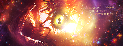
loving the first one
i like what you did with the hokage hat on naruto, and the lighting stripes sorta thing (forgive me for not using GFX terms, I'm a newb and dont know any)
They say what goes up must come down but,
Don't let me fall
Latest Work
-
1..the texture that you put on the left side.. isn't constant. Makes it look a little odd.
And the second, try experimenting with colors. It looks very monochromatic.
-
i hear what ur saying corlosr idk why but for some reason i just cant get that left side to look right, its been bugging me for a while now but it looks a lot better then it did, it used to just be a fade out to black and it looked to plain on the left side so i had to just thorugh something in there for now.
-
1.) The effect is coming along but could still use some work. Blacks and Greys in general in art don't mean anything and generally rob an art piece of color and design value if the rest of the piece isn't doing anything. The render is a little dark and needs to be addressed more.
2.) Sort of a similar issue. There are a couple effects going on but without a point, a deciding controlling point by the artist through whatever effect, they mean nothing. There is nothing drawing my eye to the focal point which is the person. Not to mention the person himself is being washed out on the whole. Your render, like your previous signature, needs to be addressed.
Don't despair however, I am having this issues as well being new to signature creation too. I am finding through all the tutorials I am doing modifying the stock and the render you are working on comes with time exploring the general opacity changes that come with the various blending options of Photoshop or whatever photo manipulation software you are running. Not to mention the entire library of effects you can generate just by messing with filters, color, light, and depth creation.
Thanks be to JDragon for the sweet gift.
-
thanks alot for your feedback ill defently take it into consideration at least i saved the PSD's of them so i can continue to work on them.
-
hmm, make sure your whole tagg is one piece. it has to flow, it has to look natural; as if the render was supposed to be in that area.
I like the grungy bit on the naruto one, but it doesn't fit the render's style. just keep that in mind. good examples are tutorials: if you see a tutorial of a good tagg (deviantart.com) you will notice the background is build around the render/focal
First SOTW win (301)

Gift from my secret backup santa Oath ^ <3
Gifts <-- clickie
Similar Threads
-
By savannahmis02 in forum Introductions
Replies: 3
Last Post: 01-18-2010, 01:36 PM
-
By BulleTs in forum Digital Art
Replies: 2
Last Post: 12-03-2008, 07:33 PM
-
By Mr. Kenny in forum Sigs & Manips
Replies: 6
Last Post: 11-16-2005, 11:15 AM
-
By AKH|Arazand in forum Digital Art
Replies: 4
Last Post: 08-16-2005, 12:16 PM
-
By Prismaz in forum Digital Art
Replies: 1
Last Post: 06-24-2005, 12:36 AM
 Posting Permissions
- You may not post new threads
- You may not post replies
- You may not post attachments
- You may not edit your posts
-
Forum Rules
|


 Reply With Quote