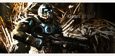
0 members and 18,235 guests
No Members online

» Site Navigation
» Stats
Members: 35,442
Threads: 103,075
Posts: 826,688
Top Poster: cc.RadillacVIII (7,429)
|
-
Gears of War
Hey Guys,
I've just started placing c4d's in my sigs, so i made one:

Tell me what yall think
Thanks
Edit: There is a border but it's white so you can't really see it
IM MAKING MY GFX WORK
My dad always told me "your lucky, when I was your age I was so poor that if I didn't have a boner on Christmas morning I had nothing play with".
-
Gotta watch your C4D work, try not to be too dependent on them. See how they really messed with your flow in this one? It's going all over the place and not coinciding with the render at all. Also the lighting is way too strong and the contrast is bad, try to lower the opacity on your gradient maps so it looks more natural and not so obvious. The renders a bit more blending, right now it's just a render throwing over some C4D work with a gradient map over top of it. Keep playing around with it and you'll get it
-
I agree with JDragon here, the c4d has overpowered the whole image. Also Dragon is right about the flow of the sig. I also noticed that it's pretty dark, and looks too sharp. Your colors aren't there for this sig as well, you have blue on the render, why not add some blue in the background and in some effects. Your text can use some work, but I like how you tried to blend it in the way you did by making it go from light to dark, like it's coming out of a shadow. Other than that I can't think of anything else, I'm sure more people will be along and give you more insight on what is right and wrong about this sig. kiu
-
i disagree with above, i've seen too many tags with too many c4d's turn out great. It all depends on how you use them. You can use c4d's to create fx, placement can create flow and depth.. Here you used them towards your bg, which is okay, but you did not use them to your advantage. I recommend you look at some c4d tag tuts. You also need to work on lighting, blending, and creating depth. Also the tag is too monotone. Notice how the gears dude has the cyan light on his armor.. you can incorporate that cyan into your colors, and can really help out the color problem. dodge and burn some parts of your bg to help you with the depth problem. Place some fx in the fg, and add some lighting. also DROP THE TEXT, it's awful. keep at it, read some tuts.
Similar Threads
-
By UriahGFX in forum Sigs & Manips
Replies: 1
Last Post: 12-11-2011, 07:03 AM
-
By Fork in forum Sigs & Manips
Replies: 10
Last Post: 12-04-2010, 03:02 AM
-
By Derosion in forum Sigs & Manips
Replies: 10
Last Post: 12-02-2010, 10:45 PM
-
By Cap'n Jazz in forum Sigs & Manips
Replies: 12
Last Post: 11-27-2010, 02:01 PM
-
By SparryGfx in forum Sigs & Manips
Replies: 13
Last Post: 10-20-2010, 06:41 PM
Posting Permissions
- You may not post new threads
- You may not post replies
- You may not post attachments
- You may not edit your posts
-
Forum Rules
|