0 members and 4,889 guests
No Members online

» Site Navigation

» Stats

Members: 35,442
Threads: 103,075
Posts: 826,688
Top Poster: cc.RadillacVIII (7,429)
|
-
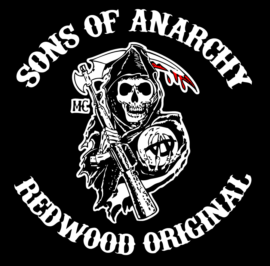
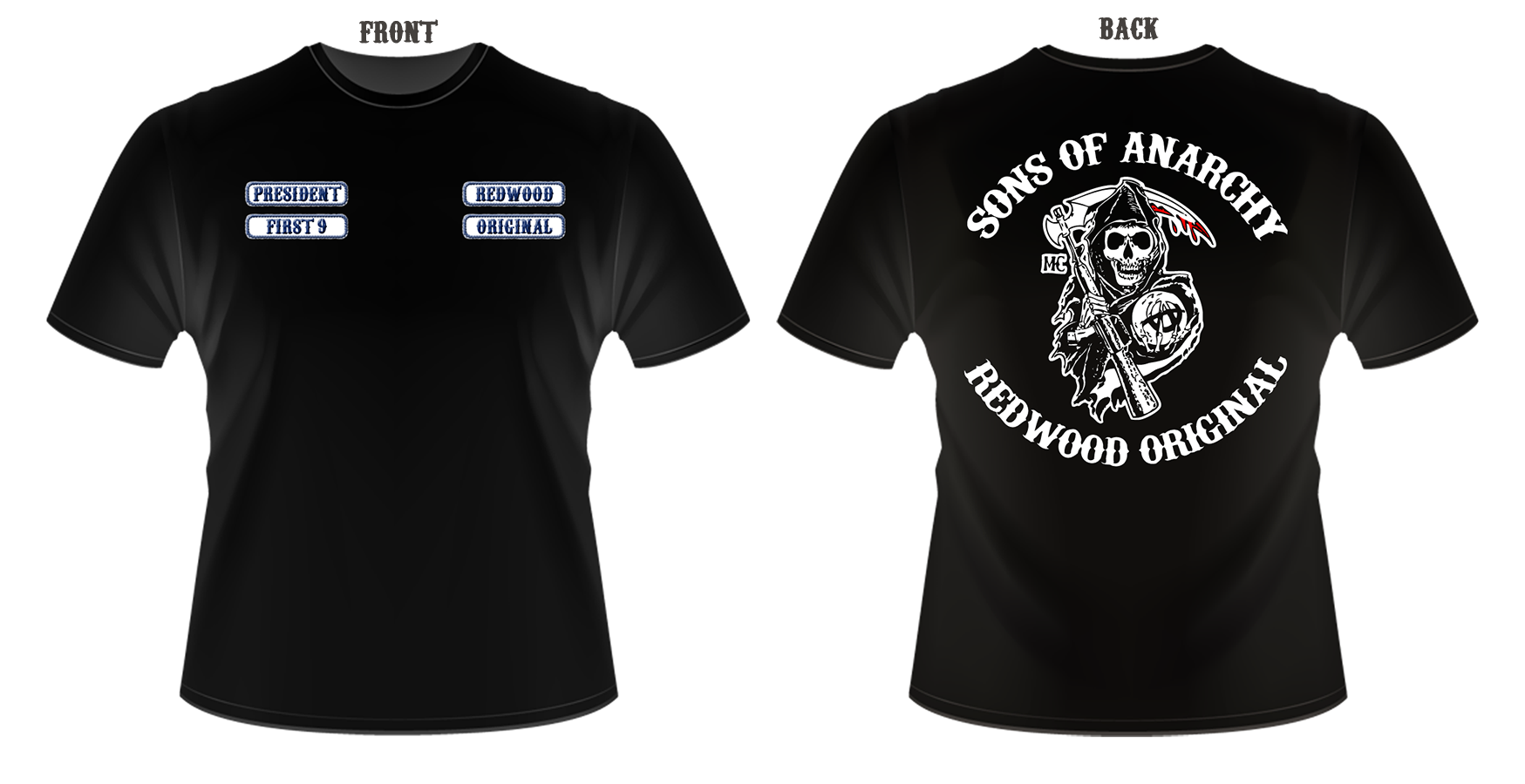
 Sons Of Anarchy T-shirt Design Sons Of Anarchy T-shirt Design
-

Not my kind of thing, but the design itself looks very nice.
T-shirts with a full print on the back rather than front always do look great, although black cotton t shirts just suck in general xD

One of the sexiest tags I've ever seen, from Radillac ↓ <3
-

This will draw attention from the public for sure  Oh lookie there, he's one of them MC thugs! Oh lookie there, he's one of them MC thugs!
I find the front somewhat boring, maybe put a scaled down version of the logo underneith the text?
-

 Originally Posted by enable

This will draw attention from the public for sure  Oh lookie there, he's one of them MC thugs!
I find the front somewhat boring, maybe put a scaled down version of the logo underneith the text?
This. Needs a little more on the front. And a bit more red to tie it all together.
-

Thanks guys!
Added a V2 with more details on the chest, how about it?
-

 Originally Posted by cC.RadillacVIII

Thanks guys!
Added a V2 with more details on the chest, how about it?
I'd rather see those patches on the sleeves. Keep the V1 text on the chest and ad the logo underneith, and then put the patches on the sleeves.
-

I like the back of the shirt...front not so much...
Skype: NovruzeliHuseynov

^ LOVE YOU RAD ^
-

Tbh I think V1 of the front looks fine, it would look silly to have any more than that when its printed on both sides.
On the subject of sleeves though, Diesel recently did this top which looks alright to me, with text prints on both sleeves, works quite well imo
http://store.diesel.com/gb/t-shirt_cod37336453xh.html

One of the sexiest tags I've ever seen, from Radillac ↓ <3
-

 Originally Posted by xX.Distelo

Tbh I think V1 of the front looks fine, it would look silly to have any more than that when its printed on both sides.
On the subject of sleeves though, Diesel recently did this top which looks alright to me, with text prints on both sleeves, works quite well imo
http://store.diesel.com/gb/t-shirt_cod37336453xh.html
It's a "motorcycle gang" tshirt, not some high-end clothing......
EDIT: That shirt looks like poop aswell.
-

 Originally Posted by xX.Distelo

Tbh I think V1 of the front looks fine, it would look silly to have any more than that when its printed on both sides.
On the subject of sleeves though, Diesel recently did this top which looks alright to me, with text prints on both sleeves, works quite well imo
http://store.diesel.com/gb/t-shirt_cod37336453xh.html
Gotta agree with that, it's the back that should have most focus.
And that diesel shirt, the text is way to huge >.z
Similar Threads
-
By Lith in forum Digital Art
Replies: 7
Last Post: 05-03-2010, 12:24 PM
-
By Ballinfolyf131 in forum Digital Art
Replies: 4
Last Post: 11-16-2009, 07:19 AM
-
By [PHXN] New001 in forum Digital Art
Replies: 5
Last Post: 05-16-2008, 10:23 AM
-
By Sobek in forum Sigs & Manips
Replies: 7
Last Post: 01-20-2006, 05:16 AM
 Posting Permissions
- You may not post new threads
- You may not post replies
- You may not post attachments
- You may not edit your posts
-
Forum Rules
|




 Reply With Quote


