0 members and 26,370 guests
No Members online

» Site Navigation

» Stats
Members: 35,442
Threads: 103,075
Posts: 826,688
Top Poster: cc.RadillacVIII (7,429)
|
-
-

It's really LQ and the render needs to be blended more, but I like the style of the tag, and the ideas, also the watermark of SoTW looks a little strange imo.
"Don't let Victories go to your head, or defeats to your heart."

-
-
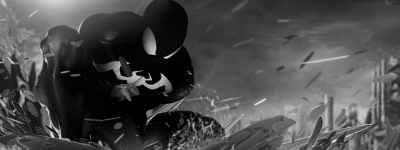
I really can't tell if its just because I've had a pint, or that sig looks incredibly blurry.
Last edited by Distello; 05-26-2012 at 01:29 PM.

One of the sexiest tags I've ever seen, from Radillac ↓ <3
-
 Originally Posted by Shniper1337

SOTW entry for another forum
CnC please
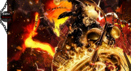
A few things here
1) yeah it's blurry so create a new layer, apply the image (image>apply image) and go to filter >sharpen>sharpen
If you now go to edit>fade sharpen, make it look a bit more natural, should help
2)The sotw looks real out of place, there's plenty of points that could have been moved to, the headlight of his bike for one, and the chain behind it is cut off
3)You've made a decent attempt at flow, well done for that, with the C4D in the bottom right corner, but it should've been behind the wheel and in front of the spotlight, instead of the other way round, to make depth more realistic
Overall it's a fairly decent attempt and I would suggest doing it again to try and improve, well done though
Similar Threads
-
By nawtygeezer in forum Sigs & Manips
Replies: 0
Last Post: 05-02-2011, 04:59 PM
-
By rockerdish in forum Sigs & Manips
Replies: 10
Last Post: 10-07-2009, 07:41 PM
-
By Mangos in forum Battlegrounds
Replies: 1
Last Post: 11-16-2005, 07:13 PM
-
By Sobek in forum Digital Art
Replies: 10
Last Post: 08-31-2005, 02:59 PM
-
By Runch in forum Sigs & Manips
Replies: 2
Last Post: 06-30-2005, 01:12 AM
 Posting Permissions
- You may not post new threads
- You may not post replies
- You may not post attachments
- You may not edit your posts
-
Forum Rules
|


 Reply With Quote


