0 members and 636 guests
No Members online

» Site Navigation

» Stats

Members: 35,442
Threads: 103,075
Posts: 826,688
Top Poster: cc.RadillacVIII (7,429)
|
-
 Stuck.. Stuck..
im stuck any suggestions??

-

Some ^^
Well just to give you a little info on eye view and the fundamentals of vision and how it works.
When working with tags it's always best to have main focus closer to center then on edge, especially when adding text, you don't wish to put it on the very opposite side of your focal, this would cause some distraction and pull focus away from your real piece.
Your flow is kind of bunchie too, her face is giving you flow of top left to bottomr right, by following her chin line this is where I am getting it from.
there seems to be smudge work in the background that would look real lovely with this piece, but you put some sparkle brush and a flower and smokishness ontop, killing the detail/wicked atmos. I would suggest going back and sticking with the smudge work but rotate it so it's bringing the attention back onto your focal.
Might want to get a gray layer put on soft light and with burn and dodge tools play around with your shadows a little, ot give it a punch of depth.
Hope I helped ^^
 Radi's one of a kind gift <3
 ^My Wish List^

-

I don't like it.
The text doesn't blend, you should only use text when you know if it will go well with the tag.
The size of the tag. I don't know if it was your plan to do it like this but i think it's too small, I'm a person who likes big works, but that's just me.
Try blending the render with that smudge cause I feel it's not blended.
Watch some tutorials on tagmaking.
Hope I helped.
From BuBBlez

-

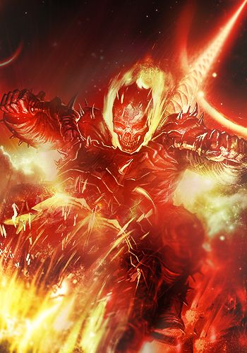
went back and took out alot of excess as mentioned by slave.
i appreciate the comments, please mind the noobish work im a bit rusty.

-

Everyone has to work at it at some point. I have also taken breaks before and when that happens it's a hell of a time getting back into the game >.<
Much cleaner and more focused, working well 
your lighting is right and the colours more flowing.
 Radi's one of a kind gift <3
 ^My Wish List^

-

Tutorials, my friend. Tutorials, tutorials, tutorials. You need to update your skillset and learn new techniques, that's all. Do 2 or 3 tutorials a day. If you really focus and try to get an incredible result they should take 30-60 minutes each. Then once you do them all, make a tag that incorporates something from each.
Also, use quality renders. She looks like she was originally in super low resolution and like she was grainy. Stick with -massive- renders, like 1000x1000 or bigger, and shrink them. They'll look much more high quality and sharp in the end.
On this sig in particular : the text is no good. Don't worry about text, just drop it. You can add it if you want your name on it, but that'll come with time and a good eye. It's a little too contrasty for your lack of a well defined light source. The light is obviously coming from the right, but your signature is by no means extremely bright on the right hand side. She's not blended well, if at all. Duplicating the render layer and playing around with the edges through smudging/distortion filters and then erasing the areas that are too distorted is how I blend my renders. Also, it's good to have -some- stuff over top of the render, through in your case it's just her face, so it's hard to do.
Last edited by Dolce; 07-02-2012 at 09:00 AM.
Similar Threads
-
By A Can Of Win in forum Sigs & Manips
Replies: 19
Last Post: 01-19-2011, 03:51 PM
-
By tekken in forum Digital Art
Replies: 1
Last Post: 04-10-2010, 04:17 PM
-
Replies: 6
Last Post: 03-23-2010, 04:19 PM
-
By dismal in forum Digital Art
Replies: 4
Last Post: 03-10-2009, 08:19 PM
-
By Jakska in forum Digital Art
Replies: 10
Last Post: 02-10-2005, 05:00 PM
 Posting Permissions
- You may not post new threads
- You may not post replies
- You may not post attachments
- You may not edit your posts
-
Forum Rules
|


