0 members and 453 guests
No Members online

» Site Navigation

» Stats

Members: 35,442
Threads: 103,075
Posts: 826,688
Top Poster: cc.RadillacVIII (7,429)
|
-
 Worstplayers Progression! Worstplayers Progression!
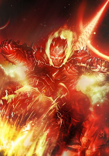
3 Latest ones iv'e done.( This week)


-

You know progression is a kind of speedart? And thats why i looked at this thread?
-
-


-

the torres one is too simple.
From BuBBlez

-

Did an other just for you! less simple XD

-

too bright and what is that black thing on the left?
From BuBBlez

-

Love it when I see someone coming into gfx and they attempt to utilize all the tools!!!
I started out the same way, trying everything, seeing how one tool works along with the next. It's a great way to get used to your program and what you want out of it.
As stated, text is a really hard thing to master ( i never did) though that might be because more then half of us ditch it becuase what someone else might like, others hate. If you really wanna keep text in keep at it brah and improve with every piece.
What might help you improve is the layout of your designs.
Try to keep the text close and hugging your focal, this allows for the viewer not to get distracted. Secondly work on placement of the focal, usually off center is the best course.
Text also tends to look good if the colours have been copied from the focal or at least look like they can be camouflaged in with the piece. One more advice that I always make mistakes with, try not to use stuff like outterglow etc with text, best thing out of all that text extra is drop shadow, besides that try to work it out on your own ^^
 Radi's one of a kind gift <3
 ^My Wish List^

-

 Originally Posted by h3rald

too bright and what is that black thing on the left?
i made it darkness to light, some black smudging, where is it to bright cause i tried givin it an effect
new layer over it than draw something with a black color brush then smudged and lil ripple
-
Similar Threads
-
By Annokill in forum Sigs & Manips
Replies: 9
Last Post: 05-28-2012, 06:43 AM
-
By uHbuv in forum Sigs & Manips
Replies: 3
Last Post: 01-21-2012, 04:03 AM
-
By AntiEmperor in forum Sigs & Manips
Replies: 5
Last Post: 08-09-2008, 05:38 PM
-
By unit_number_43 in forum Digital Art
Replies: 6
Last Post: 04-06-2007, 12:14 PM
 Posting Permissions
- You may not post new threads
- You may not post replies
- You may not post attachments
- You may not edit your posts
-
Forum Rules
|


