GFXVoid Graphic Design Forum

Remove Text Formatting
Loading...

» Online Users: 688

0 members and 688 guests
No Members online

» Site Navigation

 > FAQ

» Stats

Members: 35,442
Threads: 103,075
Posts: 826,688
Top Poster: cc.RadillacVIII (7,429)
Welcome to our newest member, Lekelindids
Results 1 to 10 of 10
  1. #1
    Join Date
    May 2011
    Posts
    120

    Red face The Dark Night Rises


  2. #2
    Join Date
    Jun 2012
    Location
    ATLANTA!
    Posts
    72

    Default

    ummmmmmm no. Like the green color is cool (i would havve done neon blue...but thats just me) but i REALLLLLY dont like the lettering.

  3. #3
    Join Date
    May 2011
    Posts
    120

    Default

    Thanks you ~


  4. #4
    Join Date
    Jun 2012
    Location
    ATLANTA!
    Posts
    72

    Default

    welcome.
    i use gimp and paint.net


    A wise man once said: It's not the size of the boat, it's the motion of the ocean. :P

  5. #5
    Join Date
    Jul 2012
    Posts
    28

    Default

    Nice tag, text can be better, id drop it. And blend the right shoulder better

  6. #6
    Join Date
    Jul 2012
    Posts
    28

    Default

    Ohh and btw, id have chosen yellow/orange
    Suits better

  7. #7
    Join Date
    Aug 2010
    Location
    Im Problly In The Sky Swimming With The Fishes
    Posts
    155

    Default

    Text kills this


  8. #8
    Join Date
    Nov 2008
    Location
    Costa Rica
    Posts
    264

    Default

    Text and oversharpen for me :S I like the lightning
    .:|Favorite|:. - - - - - .:Newest:.

  9. #9
    Join Date
    May 2011
    Posts
    120

    Default

    Thanks you all


  10. #10
    Join Date
    Jul 2012
    Posts
    9

    Default

    I really love the composition here, I think the light sources are very good. but the lack of variety of color makes me think that it could be exciting with more accents? like a yellow or orange one, but that's just me 
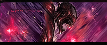
I think what brought it down was the text because it's very hard against the signature and because it's so cloistered, makes it very unbalanced

Similar Threads

  1. Dark Knight Rises midnight release shooting
    By cC.DOMINO™ in forum The Void
    Replies: 35
    Last Post: 08-02-2012, 06:56 AM
  2. The Dark night rises
    By STRiiK3R in forum Sigs & Manips
    Replies: 0
    Last Post: 07-22-2012, 01:32 PM
  3. Dark Night
    By sirenzo in forum Sigs & Manips
    Replies: 9
    Last Post: 08-27-2010, 02:13 PM
  4. another sig for the night
    By roarnation in forum Sigs & Manips
    Replies: 4
    Last Post: 03-14-2008, 05:31 PM
  5. My Night
    By asdio in forum Digital Art
    Replies: 0
    Last Post: 02-25-2008, 02:56 PM

Posting Permissions

  • You may not post new threads
  • You may not post replies
  • You may not post attachments
  • You may not edit your posts
  •  
Powered by vBadvanced CMPS v4.1.1