0 members and 26,370 guests
No Members online

» Site Navigation

» Stats
Members: 35,442
Threads: 103,075
Posts: 826,688
Top Poster: cc.RadillacVIII (7,429)
|
-

This is my first tut, comments appreciated!
if you've seen this otherwise I apologize, I did not mean to rip it, it is simply something I have figured out during my time with Photoshop.
Open a new picture (any size, though I always find that square is best with anything)
Filter>Render>Clouds
Filter>Render>Difference Clouds
Image>Adjustments>Hue/Contrast
Make sure that the colorize box is checked
use the hue and contrast sliders (not lightness) and choose whatever color you like
Now duplicate the layer
Change the new layer's Blend mode to Difference (you should now have a black screen)
on the duplicate layer:Filter>Sketch>Chrome
(the duplicate layer/difference/chrome technique is something that I have found to be useful just about anywhere, its a pretty interesting effect.
viola!
-
Nice tutorial man, it might help if you had some pics (if you dont know how PM me and i'll tell you how). But none the less great tut and i like the effect good work.
-
ya ya pics are good, pics are helpful, meh i followed and ended up with this.....
is that what i should be getting?
-
its interesting but could do with picz. Crome doesnt look too good anymore either, try brushing over it as well.
-
It seems like a nice effect (I have done it yet... ><) But you should add pictures... All tutorials need pictures ^^ I havent seen this effect before, nice job ^^
-
Seems like a cool effect, Ill try it in a second. thanks man. Pictures would make it even better haha. nice job though anyway
-
Wasn't too sure about how this would turn out, but from Rebound's pic it looks like something I have to try. :]
-
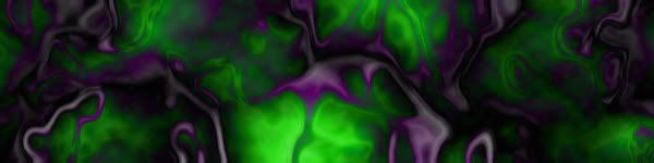
I did green, got this result, another nice and easy tutorial - good work, I quite like it 

Just to be picky it's voila not viola. :P viola is a string instrument.
-
I dont find one instruction:
Hue/Contrast =P i have Hue/Saturation and my result is gray 
...Forget everything you know about life, work, death, dreams, hate, sex, love... and just open your eyes
-
Sweet, pretty alien-ish :P
I'll use it sometime 
Similar Threads
-
By *Peng* in forum Sigs & Manips
Replies: 7
Last Post: 09-14-2005, 03:19 AM
-
By the_dude_of_darkness in forum Other Tutorials
Replies: 15
Last Post: 09-13-2005, 10:40 AM
-
By Ink Eyes in forum Sigs & Manips
Replies: 1
Last Post: 01-30-2005, 08:36 PM
 Posting Permissions
- You may not post new threads
- You may not post replies
- You may not post attachments
- You may not edit your posts
-
Forum Rules
|


 Reply With Quote


