GFXVoid Graphic Design Forum

Remove Text Formatting
Loading...

» Online Users: 26,370

0 members and 26,370 guests
No Members online

» Site Navigation

 > FAQ

» Stats

Members: 35,442
Threads: 103,075
Posts: 826,688
Top Poster: cc.RadillacVIII (7,429)
Welcome to our newest member, Lekelindids
Results 1 to 4 of 4

Thread: Spaceman LP

  1. #1
    Join Date
    Dec 2012
    Posts
    143

    Default Spaceman LP


  2. #2
    Join Date
    Oct 2009
    Location
    The Netherlands
    Posts
    2,776

    Default

    So he is advertising for Red Bull in deep space haha!
    Kinda like it but has a "hazy" look. I'd clean that up a bit.

    XL

  3. #3
    Join Date
    Nov 2009
    Location
    Belgium
    Posts
    358

    Default

    Would be much better with some more color variation imo. It would also allow a little more effects which would make it better.
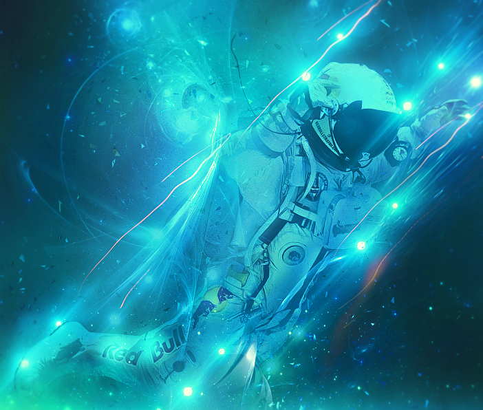
    It feels a bit like a WIP to me because when you look at it there isn't so much going on effectwise, but at the same time the piece is filled with blue and anymore might ruin it. There are several ways to solve this for example a simple black and white gradient on luminosity would already go a long way. Nice piece nonetheless. I just feel like there's more potential.


  4. #4
    Join Date
    Dec 2012
    Posts
    143

    Default

    tnx!

Similar Threads

  1. Spaceman Sig CnC
    By Alex B in forum Sigs & Manips
    Replies: 10
    Last Post: 04-03-2011, 04:45 PM
  2. Spaceman
    By SSSSK in forum Sigs & Manips
    Replies: 4
    Last Post: 01-23-2011, 07:06 PM
  3. SPACEMAN
    By jorrne in forum Sigs & Manips
    Replies: 1
    Last Post: 07-13-2009, 04:06 AM
  4. Orange spaceman tag
    By rand0mhero in forum Digital Art
    Replies: 2
    Last Post: 07-17-2007, 07:00 AM

Posting Permissions

  • You may not post new threads
  • You may not post replies
  • You may not post attachments
  • You may not edit your posts
  •  
Powered by vBadvanced CMPS v4.1.1