0 members and 2,418 guests
No Members online

» Site Navigation

» Stats

Members: 35,442
Threads: 103,075
Posts: 826,688
Top Poster: cc.RadillacVIII (7,429)
|
-
 Scared Child Scared Child
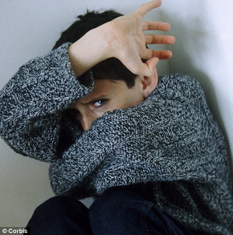
Proud of this sig, inspiration came when i was lying in bed and i was like yeah i need a scared kid surrounded by a fuck load of c4d's
originalé:

mine  :

-
-

The problems in the blending and composition between the child and the c4d's. The colors nor the shapes match and right now you have a sig with 3 unblended layers. The bubbles, the renders and the guy. They need to connect with eachother.
I also think you squeezed in the guy way too much + changed the flow in the wrong direction. The flow shall follow his arm, from bottom left to top right.
The lighting and text is okay, I'd just change the mega font and place all text over his shoulder.
In short: open up for depth, blend colors and elements and give it a correct flow.
Always fun to try something new and you learn best by experimenting 
-

i made another version minus the text with slightly more blending however squeezing the child was my objective, he is afraid of all the c4d's tightening him up so by you saying i
you squeezed in the guy way too much
makes my life complete -_- thanks for the tips and check this version
 
-

You could make the c4d's wrap around his arms and closing in on him, rather than overlapping him.
The blending is a bit better now but the colors, play around with selective color and I'm sure it would do the trick.
The rest still remains tho, but everything I said is my personal taste and I respect the concept you had in mind.
-

 Originally Posted by cC.RadillacVIII

The problems in the blending and composition between the child and the c4d's. The colors nor the shapes match and right now you have a sig with 3 unblended layers. The bubbles, the renders and the guy. They need to connect with eachother.
I also think you squeezed in the guy way too much + changed the flow in the wrong direction. The flow shall follow his arm, from bottom left to top right.
The lighting and text is okay, I'd just change the mega font and place all text over his shoulder.
In short: open up for depth, blend colors and elements and give it a correct flow.
Always fun to try something new and you learn best by experimenting 
I totally understood where you were coming from, and I agree. I understand where you want to go with this piece, however, I believe you should focus on the arms more, you are chaning up the flow.
Also, maybe overlaying with with a darker red hue, or perhaps a red to black gradient. Just gotta work with that blending, give it some depth
Synsational: "I got so many products in my hair that your Anus hair would probably smooth out too. You'd end up getting a job modeling ass hair for Tres Emme."
Similar Threads
-
By TehTaterSalad in forum Digital Art
Replies: 9
Last Post: 02-21-2011, 04:15 PM
-
By Opt1k4l in forum Sigs & Manips
Replies: 4
Last Post: 12-23-2010, 03:26 PM
-
By ketg in forum Sigs & Manips
Replies: 1
Last Post: 10-08-2010, 10:24 PM
-
By Sirlock in forum Sigs & Manips
Replies: 2
Last Post: 10-02-2010, 04:00 PM
-
By OddTodd87 in forum Introductions
Replies: 2
Last Post: 06-19-2005, 01:57 PM
 Posting Permissions
- You may not post new threads
- You may not post replies
- You may not post attachments
- You may not edit your posts
-
Forum Rules
|
:

