GFXVoid Graphic Design Forum

Remove Text Formatting
Loading...

» Online Users: 871

0 members and 871 guests
No Members online

» Site Navigation

 > FAQ

» Stats

Members: 35,442
Threads: 103,075
Posts: 826,688
Top Poster: cc.RadillacVIII (7,429)
Welcome to our newest member, Lekelindids
Results 1 to 5 of 5
  1. #1
    Join Date
    Jul 2005
    Posts
    23

    Thumbs down

    How this sig?


    ?

  2. #2
    Join Date
    Jun 2005
    Location
    Manchester, Uk
    Posts
    4,648

    Default

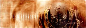
    Nice but the text is a little bright on the "EW AVEN" part of new avengers, also just below the E in NEW there is like a distinct line that divides the orange to the lighter colour and it just looks slightly weird try blending that up a bit and try maybe unblending the render on the left side on his shoulder because it's little too blended and it might look good with the text overlaying it but other than that i like yer brushing and the tech parts GJ
    deaz\dxloa\dxedr


  3. #3
    Join Date
    May 2005
    Location
    INSIDE BFG'S HOUSE.
    Posts
    1,132

    Default

    wow, i really like the text! maybe a tut on how to do that please?

    nice job, shame about the text blending with the background so you cant read it.

  4. #4
    Join Date
    Jul 2005
    Posts
    23

    Default

    hmm..
    do the text..
    and than duplicase layer, and than motion blur..

  5. #5
    Join Date
    Jun 2005
    Location
    The Schwa, Ontario, Canada
    Posts
    1,324

    Default

    It'sa very, very nice.

    +1 post count

Posting Permissions

  • You may not post new threads
  • You may not post replies
  • You may not post attachments
  • You may not edit your posts
  •  
Powered by vBadvanced CMPS v4.1.1