0 members and 7,879 guests
No Members online

» Site Navigation

» Stats
Members: 35,443
Threads: 103,072
Posts: 826,684
Top Poster: cc.RadillacVIII (7,429)
|
-

This is a very easy tutorial on creating a motion-type blur font. It can be used to create signatures, website headers, and much more!
Step 1

Creat a new document, and add some text to it. The text should be a darker shade (for better visibility).
Step 2
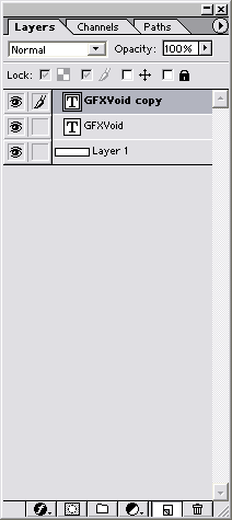
Copy the text layer you just created, by dragging the layer to the bottom icon (in your layers window)
Step 3

Change the color of the origional layer (the second text layer). I selected a lighter blue, although darker colors work fine too!
Step 4
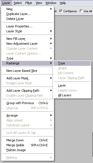
Rasterize your second layer (the above layer you just colored), in the above menu.
Step 5
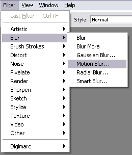
On your second text layer go to the Motion Blur Filter in the above menu.
Step 6
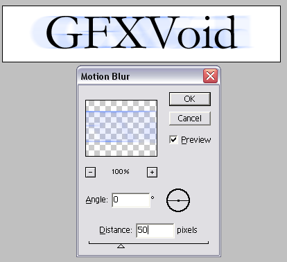
Use the above effects once you clicked the motion blur. You can experiment with the distance, but I found 50 looks best.
You can stop here, but because the bottom blur-text layer I used was light, I decided to darken it up a bit...
Optional Step 7
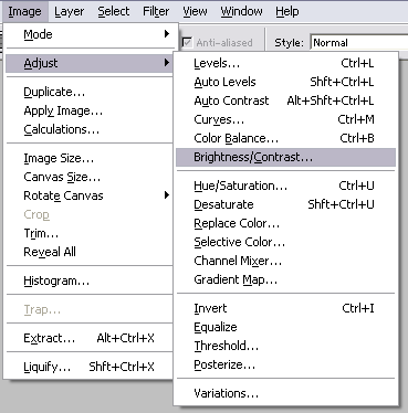
Go to the Adjust Brightness/Contrast option under the Image menu (shown above).
Optional Step 8
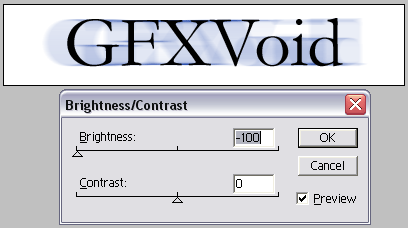
On your blur-layer, darken it 100^ to make the text blur effect more noticeable.
Final Product

Here is my final product!
If you have any questions or comments, please post below so we could help you! Thanks for reading!
-
I like it, nice job, thanks.
-
oh yea nice tut man
PS: Twan nice sig  the first one the first one
-
oO~ I've always wondered how they did that effect~ thanks for the tutorial
-
That looks amazing dude. I like the effect a lot!
-
Just as another way to use this tutorial, you can set the angle of the motion blur to 90 if you want it a vertical blur. If you make this rasterized layer the same color as the original text, and lower the opacity a bit, the text almost looks ghostly, it's cool
-
that's one nice tutorial you've got there mate
-
wow. i wondered how you guys make those nice text effects...
-
nice tut man but there r very easy for someone to follow them.try to make and write a new tut wich will be more impressive
if u want you can make an animation image ...... 
-
it looks a bit like the matrix logo :P lol
 Posting Permissions
- You may not post new threads
- You may not post replies
- You may not post attachments
- You may not edit your posts
-
Forum Rules
|


 Reply With Quote


