0 members and 3,969 guests
No Members online

» Site Navigation

» Stats
Members: 35,443
Threads: 103,072
Posts: 826,684
Top Poster: cc.RadillacVIII (7,429)
|
-

hey guys been gone for awhile heres some of my work since then!

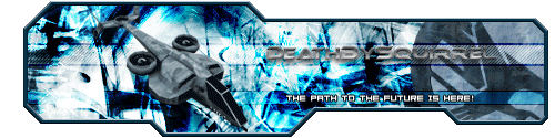
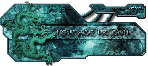


thats just some of my work hope you guys like!
-
I like your work alot, you've been doing great.
The first one is nice though the logo on the write messes it up a but, make it more transparent.
I like the border and bg of the second sig but you need to blend the dragon in more, match the colors.
The 3rd one has a cool man on it but it goes from nothing one the right to a weird bg on the left so its flipped mate.
I love the ideo of the 4th one, its nicely done, though a bit to dark.
The 5th has a bad bg so that one is crap.
I think the 6th is the best, I love the softness of it.
And the sig you have now is great.
nice work man, try to blend your images more and then your sigs will be wickid, continue your work.
-
They're all odd sizes, and to be honest...I don't really like them.
-
like the second one, but them again im not to fond of sigs...
made mine like when i started using PS lol
-
i like the second one, but i don't like the animations in it...
-
I think the 4th sig looks nice.
This is me.

-
A lot of it's cluttered, there's too much going on. There's too much up there for me to begin critiquing specific instances, but you obviously know what you're doing, you just have to figure out now what looks good and what doesn't.
-
Well i candefinately see you have improved, still a little messy and you use too many colours and tones in some of them, like with the renders... and also too many textures, and feelings... if you want to make things like with more texture you have to know a bit more about your placement and structure but good, my favourites are the anti-penultimate and the last one 
deaz\dxloa\dxedr

Similar Threads
-
By jerner in forum Sigs & Manips
Replies: 7
Last Post: 08-27-2005, 05:01 PM
 Posting Permissions
- You may not post new threads
- You may not post replies
- You may not post attachments
- You may not edit your posts
-
Forum Rules
|


 Reply With Quote


