0 members and 295 guests
No Members online

» Site Navigation

» Stats
Members: 35,443
Threads: 103,072
Posts: 826,684
Top Poster: cc.RadillacVIII (7,429)
|
-

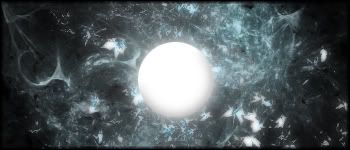
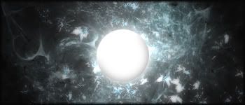
Fun fun... not sure which i like better so ill let you all decide for me  ...C+C..Current? (which one) ...C+C..Current? (which one)
so yeah here they are...
V1...No lighting effect
V2...Lighting
-
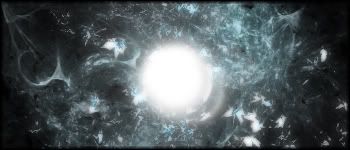
not too sure about the orb :huh:
but the brushing looks good i like it 
-
Prefer the one without lighting i think. I like the bg, but the orb, to me, looks like someone stuck a white chocolate button onto the front. o.o It also feels a bit unfinished imo...
-
its not entirely finished gonna go back later and add to it a bit more
-
Oh ok, sorry. Well don't forget to post the finished one
-
Personaly i like the 2nd 1, because the ORB dosn't look as much out of place due to the effects of the lighting around the Orb. if u get wht im saying :s
-
Updation....
-
The random white blob in the middle spoils it,doesnt look like anything.
The brushing is dull and the sig has no depth, theres no text on it :mellow:
Get rid of the random white thing, add a brihtness contrast layer and put some text on, and get rid ofthat border and doa 1picel black, thatlooks weird whatever you done there
 Posting Permissions
- You may not post new threads
- You may not post replies
- You may not post attachments
- You may not edit your posts
-
Forum Rules
|


 Reply With Quote
