0 members and 5,976 guests
No Members online

» Site Navigation

» Stats
Members: 35,443
Threads: 103,072
Posts: 826,684
Top Poster: cc.RadillacVIII (7,429)
|
-
07-29-2010, 04:17 PM
#3971

I like the colours, they fit well.
7/10
-
07-29-2010, 04:35 PM
#3972
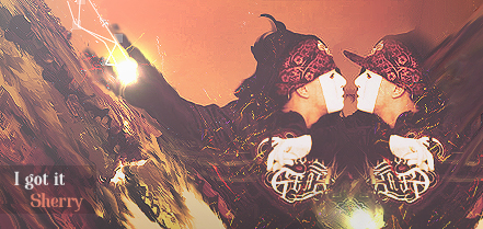
7/10 needs more flow and face is oversharpened 
6/10
thanks naruto <3


 Originally Posted by littlefeet

they say until it happens they wont believe it, but if it ever does happen, they'll say it didn't actually happen. So it can actually never happen to them, even if it does happen to them
<< LOL
-
07-29-2010, 07:58 PM
#3973
6/10 love flow but text bugs me and a little dark
8/10 again like the flow but if your text was a bit better would be a 10 atleast a 9
HONOR
If I Live I will Kill you, If I Die you are forgiven
-
07-29-2010, 08:54 PM
#3974
5/10
sorry man
i like the color choices but the sig itself is rather unexciting for me
to many conflicting aspects for me that don't blend well
-
07-29-2010, 09:16 PM
#3975
ya I was trying some stuff I used to do but im really rusty haha
HONOR
If I Live I will Kill you, If I Die you are forgiven
-
07-29-2010, 09:37 PM
#3976
5/10. I like the cleaness of it, but the text is awful and the background is pretty boring.
-
07-29-2010, 10:06 PM
#3977
5/10 not much to it kinda like the flow of the purple
I changed things about the last sig better now?
HONOR
If I Live I will Kill you, If I Die you are forgiven
-
07-29-2010, 10:15 PM
#3978
thanks naruto <3
Originally Posted by littlefeet
they say until it happens they wont believe it, but if it ever does happen, they'll say it didn't actually happen. So it can actually never happen to them, even if it does happen to them
<< LOL
-
07-29-2010, 10:18 PM
#3979
1st, Effect's color's could be blended. To make it better, text and scanlines could be placed better. so um 5/10 couldda been a great sig.
2nd Nice way to use c4ds, but make depth/focal. Better text too.
6/10 keep it up.
-
07-29-2010, 10:51 PM
#3980
6/10. Oversharpened and I don't like how small the render is.
8/10. I love the lighting but it's a little boring. Pretty sleek though.
Similar Threads
-
By SgtSwabs in forum The Void
Replies: 16
Last Post: 12-06-2005, 08:42 PM
-
By LunarPoet in forum Sigs & Manips
Replies: 1
Last Post: 06-23-2005, 12:31 PM
-
By Xavier in forum Sigs & Manips
Replies: 8
Last Post: 06-03-2005, 01:46 AM
 Posting Permissions
- You may not post new threads
- You may not post replies
- You may not post attachments
- You may not edit your posts
-
Forum Rules
|


 Reply With Quote