0 members and 1,271 guests
No Members online

» Site Navigation

» Stats
Members: 35,443
Threads: 103,072
Posts: 826,684
Top Poster: cc.RadillacVIII (7,429)
|
-
11-19-2006, 10:28 AM
#401

Green?
Wahey, Last FM is win
-
11-19-2006, 01:18 PM
#402
-
11-19-2006, 02:14 PM
#403
5.5/10
i like the backround and the concept u gave to yur sig....juss it is an extremely borin sig
..The Dream.
SOTW #73 Winner
-
11-19-2006, 02:24 PM
#404
7/10
they both rely alot on the render, but the backgrounds are kinda cool.
-
11-19-2006, 02:58 PM
#405
6/10
Like the texteffect amd the concept of the tag, but the cut looks so unnnatural...
You can conquer the world with money and fame
but dont ever forget your place in the game
or grow to big for your frame so it conseals the jealousy and shame that stands next to your name - Into
 
-
11-21-2006, 09:50 PM
#406
6/10
The blending on the 2 renders need work.
Latest:

-
11-21-2006, 09:53 PM
#407
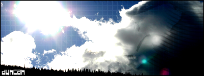
light source is way to big, background lacks depth, is pretty boring/simple, and the dissolve effect on the render really looks bad in this. render isnt blended, and the lighting is really messed up on it, and the text is placed really poorly, but its ok text aside from that.
-
11-22-2006, 04:16 AM
#408
i like the background but its totally overpowering the render
-
11-22-2006, 11:38 AM
#409
-
11-25-2006, 08:55 PM
#410
your latest work looks nice but the bottom one its a little plain (im not saying plain is bad ) im just saying it will look better with more blending
Similar Threads
-
By SgtSwabs in forum The Void
Replies: 16
Last Post: 12-06-2005, 08:42 PM
-
By LunarPoet in forum Sigs & Manips
Replies: 1
Last Post: 06-23-2005, 12:31 PM
-
By Xavier in forum Sigs & Manips
Replies: 8
Last Post: 06-03-2005, 01:46 AM
 Posting Permissions
- You may not post new threads
- You may not post replies
- You may not post attachments
- You may not edit your posts
-
Forum Rules
|


 Reply With Quote
")