went for the simple look.. yeah.. cnc
Text could be better.
Latest:
Text is a bit unreadable, and uh yah its simple alright :P
http://chiv.deviantart.com
I think it's a little too... "Filtered".
GFXVoid!
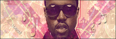
its 100% smudge
I can't say that I like it. It looks like you painted two colors on there and smudged, added text and called it finished.
<div class='quotetop'>QUOTE(Freak @ Jun 11 2006, 02:35 PM) [snapback]172748[/snapback]</div> I can't say that I like it. It looks like you painted two colors on there and smudged, added text and called it finished. [/b] Pretty much, rofl. I was bored
Forum Rules


 Reply With Quote