0 members and 2,510 guests
No Members online

» Site Navigation

» Stats
Members: 35,443
Threads: 103,072
Posts: 826,684
Top Poster: cc.RadillacVIII (7,429)
|
-

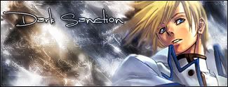
Haven't been on this forum for a while, just didn't have time.... well I made these probably inbetween 2 study sessions...


Tell me if you like em/what i can improve
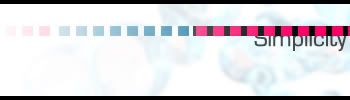
Simplicity.... is kinda gey-ish
~I anoy, therefore, I am
-
<div class='quotetop'>QUOTE(Eidur @ Jun 30 2006, 05:36 PM) [snapback]177224[/snapback]</div>
[/b]
its ok, but the light doesnt seem to hit the guys head properly. i looks more like the light is moulding into his head somehow
<div class='quotetop'>QUOTE(Eidur @ Jun 30 2006, 05:36 PM) [snapback]177224[/snapback]</div>
[/b]
i like this 1. its blended fairly well into the background, and the text looks nice. nice work
-
For the top one I like it, but the guys face looks like it melted as posted above. It just looks too blurry.
For the link one I like it even more. I do'nt see what else needs to be done.
-
The smudge use looks too exaggerated. But, it actually does it give cool, original effect. It looks as though he disappears with nothing, and appears out of nothing >_>... yeah.. I didnt go to sleep yet..
As for Link. I got nothing for that. I like it, same goes for youre current signature.
-
good job on the second one .. i love it
newest:
Like my stuff? wear my tag:
Code:
http://xs205.xs.to/xs205/06331/magicfan.png
Battles Won: 1 Battles Lost: 1
-
i think it's a nice idea that the light merges into his head.. more original don't listen to them it's good shame about the massive amount of blurring, his cape is really blurred bad.. link one is ok good lighting, but the only problem i see with it is that it looks too big for my liking and i don't like the text and that shape at all..
deaz\dxloa\dxedr

 Posting Permissions
- You may not post new threads
- You may not post replies
- You may not post attachments
- You may not edit your posts
-
Forum Rules
|


 Reply With Quote