GFXVoid Graphic Design Forum

Remove Text Formatting
Loading...

» Online Users: 5,854

0 members and 5,854 guests
No Members online

» Site Navigation

 > FAQ

» Stats

Members: 35,443
Threads: 103,072
Posts: 826,684
Top Poster: cc.RadillacVIII (7,429)
Welcome to our newest member, Lekelindids
Results 1 to 7 of 7

Thread: Need some help

  1. #1
    Join Date
    Aug 2006
    Posts
    11

    Default Need some help

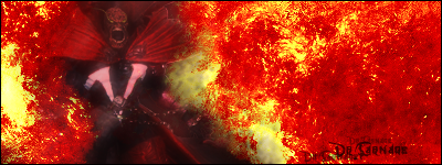
    I've been working on this sig on and off playing with it from scratch. I've been using only default brushes and a render I cut out. I'm currently Mentally Constipated artist wise... Can anyone gimme some idea for this sig? Heres where I'm at

  2. #2
    Join Date
    Jun 2006
    Location
    Hotlanta.
    Posts
    316

    Default

    First of all, that's Tenchu, right? Next, some C&C. I like the "portal" in the background and i like the outside of the portal (the darker part) but i don't like them together. I also don't like how Tenchu (or whoever the fuck it is) is faded into the background. just keep messing with it man.

  3. #3
    Join Date
    Feb 2006
    Posts
    2,688

    Default

    Thats pretty cool, definatley different then the norm.
    Some cool things to try could be:
    Add a dreamy effect inside the portal,
    add a light source in the middle of his hands
    maybe make the colors more bright/vibrant
    I dont think it needs text, so dont get stuck on that.
    Mess around with some adjustment layers

  4. #4
    Join Date
    Aug 2006
    Location
    Colorado
    Posts
    71

    Default

    I think the knife needs some spice, so here is somthing nice!
    http://forums.realgfx.net/index.php?showtopic=3636

    I really dont think the portal matches with Tenchu, but its a great cut out as far as i can see.
    "Thats right and God wills it!"

  5. #5
    Join Date
    Aug 2006
    Posts
    11

    Default

    Well, I changed the style of the portal, its now more solid and liquid looking, but thats all I've done in the mean time... lol carnage thats pimp xD

  6. #6
    Join Date
    Jun 2006
    Location
    Hotlanta.
    Posts
    316

    Default

    i agree with carnage on the glint on the sword. i think (if done correctly) it'll be cool as hell. give it a shot and see how it looks!

  7. #7
    Join Date
    Aug 2006
    Location
    Hell
    Posts
    220

    Default

    it looks like he is trying to break out of the portal (reminds me of Donnie Darko). glint, good idea. but i think the colors need more work. inside is really flat

Posting Permissions

  • You may not post new threads
  • You may not post replies
  • You may not post attachments
  • You may not edit your posts
  •  
Powered by vBadvanced CMPS v4.1.1