0 members and 4,746 guests
No Members online

» Site Navigation

» Stats

Members: 35,443
Threads: 103,072
Posts: 826,684
Top Poster: cc.RadillacVIII (7,429)
|
-
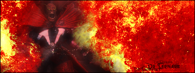
 Marv (Sin City) Sig Marv (Sin City) Sig
I used two ideas I had seen here in this sig. I like how it came out, but, it's back to the drawing board for more practice. See yas later 

-

Not exactly my style. I like more blended softer sigs. Btw, whats up with V's behind renders?
-

The only thing wrong with it i think is the expresstion on marv's face. Might be me the or the lighting but it just isnt the baddass mofo marv i know.
"Thats right and God wills it!"

-
-

looks like you hit "sharpen" one too many times
-

 Originally Posted by phantamines
looks like you hit "sharpen" one too many times
Actually, I didn't hit it once...
 Originally Posted by Dr.Carnage
The only thing wrong with it i think is the expresstion on marv's face. Might be me the or the lighting but it just isnt the baddass mofo marv i know.
Yea, It was hard catching the screenshots without him blurring, and I think it kind of caught his expression at a bad spot, but It's still a good capture, just not his bad ass look like you said.
Thanks for the feedback everyone 
-

 Originally Posted by Dyce
Actually, I didn't hit it once...
Yea, It was hard catching the screenshots without him blurring, and I think it kind of caught his expression at a bad spot, but It's still a good capture, just not his bad ass look like you said.
Thanks for the feedback everyone 
Oh man no dout on the picture i thought it was vary crisp, great job on the cut out also. Alls you need was a better expersstion keep it up man its good work.
"Thats right and God wills it!"

-

I really like this sig, I like the colors, and how it's layed out. I like sigs that are centered. Your text doesn't seem to fit this type of sig. This sig seems more of a grunge, and the font used looks more tech or just too smooth for this bg and render your using.
It's a little big for my prefrence, but I make mine quite small so not something you have to really worry about :P
While I like the coloring I think it should be just a bit stronger.
Here's an example:

Not exactly my style. I like more blended softer sigs. Btw, whats up with V's behind renders?
I've also seen a V for the bg :P but it goes really well in this bg, and nice job on the cutout. The render in my current sig is the first for about year that I've cut out lol.
[Edit] Oh yeah I also changed to border to just 1 pixel border.
-

 Originally Posted by Toshiyan
I really like this sig, I like the colors, and how it's layed out. I like sigs that are centered. Your text doesn't seem to fit this type of sig. This sig seems more of a grunge, and the font used looks more tech or just too smooth for this bg and render your using.
It's a little big for my prefrence, but I make mine quite small so not something you have to really worry about :P
While I like the coloring I think it should be just a bit stronger.
Here's an example:

I've also seen a V for the bg :P but it goes really well in this bg, and nice job on the cutout. The render in my current sig is the first for about year that I've cut out lol.
[Edit] Oh yeah I also changed to border to just 1 pixel border.
Hm... I like the changes you made, looks good. I actually had made it about as dark/saturated as you made it, but I thought it might look too dark to everyone, so I lightened it back up lol
And what font is that you used? I was trying to go with a basic font, got stuck with arial black...
-

:P I used Times New Romans.
Similar Threads
-
By Dutch-Soldier(nl) in forum Digital Art
Replies: 13
Last Post: 04-11-2006, 04:53 PM
-
By nosferatu in forum Digital Art
Replies: 6
Last Post: 12-09-2005, 04:01 PM
-
By Mynros in forum Sigs & Manips
Replies: 3
Last Post: 12-03-2005, 03:03 PM
-
By MinorThreat in forum Sigs & Manips
Replies: 3
Last Post: 03-01-2005, 06:31 PM
 Posting Permissions
- You may not post new threads
- You may not post replies
- You may not post attachments
- You may not edit your posts
-
Forum Rules
|


