0 members and 461 guests
No Members online

» Site Navigation

» Stats
Members: 35,443
Threads: 103,072
Posts: 826,684
Top Poster: cc.RadillacVIII (7,429)
|
-
-

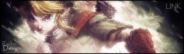
I really like it man, gj, only thing i could say is maybe a diff text, but thats just my preference on text's. ^.^ gj.
Reiko
<3
-
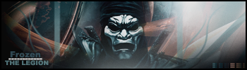
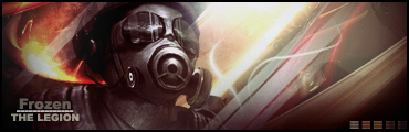
Looks alright, one thing people seem to not get is their sig needs a border.
Your brushings good and your render can do well, but you didn't blend them together. It seems that your render is just on top of your bg.
While this time it seemed you tryed to use a filter to blend it in, it still looks slapped on.
For future artwork's try to keep the render with at least some of it's original color. Most of the time making the color of your render just one color doesn't turn out well, you need multiple colors normally for a good effect.
You did keep some of the original colors but it's still dulled down to make itto monitone.
Most font should be something that sticks to basic font, unless it goes with the theme. While this font seems like you were trying to go for a military style it doesn't match the rest of your sig. Also it just doesn't go that well by iteslf to me.
My comment stays the same for the text.
You also need more depth in your bg.
Example of things you should change:

Hope this is more help since I could quote most of what I said from your last sig.
__________________
Similar Threads
-
By Dutch-Soldier(nl) in forum Sigs & Manips
Replies: 5
Last Post: 09-03-2005, 05:30 PM
-
By robgasm in forum Digital Art
Replies: 29
Last Post: 04-26-2005, 10:36 AM
-
By CrystalDragon in forum Sigs & Manips
Replies: 5
Last Post: 04-02-2005, 04:25 AM
-
By Broyom in forum Sigs & Manips
Replies: 7
Last Post: 02-15-2005, 06:36 PM
 Posting Permissions
- You may not post new threads
- You may not post replies
- You may not post attachments
- You may not edit your posts
-
Forum Rules
|


 Reply With Quote