0 members and 5,117 guests
No Members online

» Site Navigation

» Stats
Members: 35,443
Threads: 103,072
Posts: 826,684
Top Poster: cc.RadillacVIII (7,429)
|
-
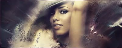
 Lady Lady

after experimenting so many things I ended up with this. 30 layers
Edit:
v2
Last edited by danielsaso; 09-23-2006 at 06:11 PM.
Reason: -
-
-
There doesn't seem to be anything that draws your attention except the render. Which means it almost makes all your brushing worthless.
Also there's quite a bit of empty space to the left and right. If you just cut off the sides it would enhance this image more than 50% already. Though I don't think you want to do that so I would suggest doing something to draw more attention to the sides.
You patterns don't fit in this sig since it just seems like it's brushed a little at the bottom. Which also just draws attention to the middle. You should add some else where.
Your text is really good, though since I'm not good with know peoples names I wasn't sure if the flowers were some hidden letter :P.
Anyway, still looks great. You might think about using stronger colors. Might not be your style but this looks a bit monitone which does good but maybe make some areas stonger.
-
Dude, these are pretty amazing sigs.
 Skillz, yo.
-
 Originally Posted by Toshiyan

There doesn't seem to be anything that draws your attention except the render. Which means it almost makes all your brushing worthless.
Also there's quite a bit of empty space to the left and right. If you just cut off the sides it would enhance this image more than 50% already. Though I don't think you want to do that so I would suggest doing something to draw more attention to the sides.
You patterns don't fit in this sig since it just seems like it's brushed a little at the bottom. Which also just draws attention to the middle. You should add some else where.
Your text is really good, though since I'm not good with know peoples names I wasn't sure if the flowers were some hidden letter :P.
Anyway, still looks great. You might think about using stronger colors. Might not be your style but this looks a bit monitone which does good but maybe make some areas stonger.
wow thank you, ill post the new version then later. Now that^ is a good comment !
-
all I can say is the the box pattern near the render looks horribly out of place. And the left side looks wya too boring.

If everyone cared and nobody cried...
If everyone loved and nobody lied...
If everyone shared and swallowed their pride...
Then we'd see the day that nobody died...
noobdesign.net ftw
-
improved right ?
-
ya before i couldnt even tell that was an arm, it looked like a big wall
it looks better but now the render looks out of place. the right side doesnt flow too well with the sig, but i think its mainly her arm that throws the sig off. there are also some weird sharpened white spots and a white thing on the far right that looks like a leaf - those seem out of place and are distracting. it also looks like a rock is coming out of her armpit. its a pretty good sig, but i like ur currents a lot so i know you can do much better.
-
wow that is great (: i wish i could make something like that! you are good!
When all else fails...dance.
-
Originally Posted by Thelma
wow that is great (: i wish i could make something like that! you are good!
For the carmen electra sig I made a tut. Its on the "Signature tutorial" section
Originally Posted by xander60
ya before i couldnt even tell that was an arm, it looked like a big wall
it looks better but now the render looks out of place. the right side doesnt flow too well with the sig, but i think its mainly her arm that throws the sig off. there are also some weird sharpened white spots and a white thing on the far right that looks like a leaf - those seem out of place and are distracting. it also looks like a rock is coming out of her armpit. its a pretty good sig, but i like ur currents a lot so i know you can do much better.
I was trying new things of what I actually do and this sig was all new for me. I left those white pieces because I would look a bit empty without them + I cant remove anymore now. The current ones are MUCH more simple than this one believe it or not. Thanks anyway
Similar Threads
-
By broken_wings in forum Digital Art
Replies: 3
Last Post: 06-10-2006, 02:24 AM
-
By Lord_badass in forum Sigs & Manips
Replies: 3
Last Post: 11-29-2005, 03:57 PM
 Posting Permissions
- You may not post new threads
- You may not post replies
- You may not post attachments
- You may not edit your posts
-
Forum Rules
|


 Reply With Quote


