0 members and 5,805 guests
No Members online

» Site Navigation

» Stats
Members: 35,443
Threads: 103,072
Posts: 826,684
Top Poster: cc.RadillacVIII (7,429)
|
-
 Update Sig Style Update Sig Style
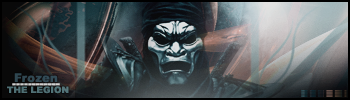
I said I would post my new results, so here they r... Please help me out the best you can, cause I am new to all this.

How can I improve?
Latest:
Persian Warrior
Favorite:
The Legion
 GFXVoid
!
-
Needs more depth. Everything is at the same level of saturation for one thing; oversaturated by the way.
Text. Still not well incorporated into the sig. Having the F in Frozen so distinguished like that doesn't really serve much purpose. Having it a different color isn't the problem, it's just that it's too different I think, so it's pointlessly over emphasized. If you leave the F as is then change 'rozen' to a color closer to the F's color but still lighter than it. Then the text 'goku,' the font doesn't really fit (sans serif 'goku' + serif 'frozen' are clashing). Change the font on it to a serif font and make it a solid color rather than using a blending mode, it usually looks better.
Personal preference perhaps but I think the left and right side borders are disruptive and don't fit well. That's where you might try an overlay/soft light blending mode, a color that matches the edges of the sig, or no side borders at all, whichever looks best.
-
bahh your thoughts on the font are misconstrued, it doesn't clash though his choice in which and serif font he used is a little bad, i reckon a more thinner font for your name would go down a treat, as well perhaps if you were to like i don't know do some layer styles on it. Plus saying the orange is pointless... is pretty pointless.. the shade of it is a tad overexagerated compared to the other warm tones in the signiture but i don't think it's pointless.. my only real qualm with it is it's contrast.. though good work.
deaz\dxloa\dxedr

-
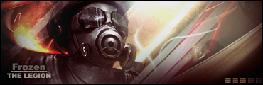
How is this?

Ty for the comments guys. I think this helps...
Latest:
Persian Warrior
Favorite:
The Legion
GFXVoid!
-
please comment on updated sig
Latest:
Persian Warrior
Favorite:
The Legion
GFXVoid!
Similar Threads
-
By Apprentice in forum Sigs & Manips
Replies: 1
Last Post: 06-23-2006, 09:54 AM
-
By Adam in forum Sigs & Manips
Replies: 4
Last Post: 08-15-2005, 08:19 AM
-
By Jakska in forum Digital Art
Replies: 2
Last Post: 03-13-2005, 06:07 AM
 Posting Permissions
- You may not post new threads
- You may not post replies
- You may not post attachments
- You may not edit your posts
-
Forum Rules
|


 Reply With Quote

