0 members and 534 guests
No Members online

» Site Navigation

» Stats
Members: 35,443
Threads: 103,072
Posts: 826,684
Top Poster: cc.RadillacVIII (7,429)
|
-
 New style of siggy.. sorta. New style of siggy.. sorta.
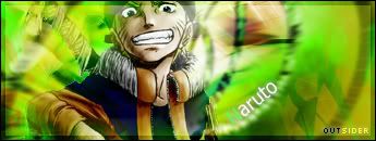
Yup.. just rolled this sig off the press. Just READY for C&C. 
-
interesting combination of yellow, orange and green... not sure i like the opacity.. of anything.. though. Nice work.
-
So.. what's wrong with the opacity? Not enough? Too much?
Also.. I got a new sig. Grayscale.
C&C, and, I just.. didn't want to make a new topic about it.. So... Yeah. XD
-
They aint really nice to tell you the truth but mine were also like those before, Keep practicing with Tuts to improve
-
Thanks for the honesty.. But, if you could tell me what to improve on, rather than a general criticism, that'd be great.
-
hehehe :P I haven't posted in this area for quite some time so I'm feeling generous and will provide some critic.
Overall it's a great idea and smooth blend of color. The contrast of black with green, orange and yellow is done well but your render is a little to dark compared to you bg.
Your render seems to be in a jungle that is almost dark, while your bg is a jungle in light. I preferably would choose the lighter.
Your should curve with your bg not just diagonal. If you need help pm me and I'll show you how. Also the "OUTSIDER" text's colors conflict with your sig colors. It doesn't seem like the yellow in "SIDER" matches your bg.
With such a sleek bg your render needs to be blurred in some areas. it's to detailed for the bg, or sharpen the bg.
For later refrences his eyes are to close to the border XD. So his focal point is his mouth which I don't think your going for :P.
Also on the "Naruto" text the "N" needs to be a bit darker and add a drop shadow with 0 distance to give it depth like your bg.
I would lighten the black brushing??? to the bottom left of the sig just a big. it's a little to dark there and draws to much attention.
Again though it's nice work just a few touch ups  . .
Hope this helps!
-
-
Holy crap. I agree with photoex. Thank you so much Nightfire!
I'll get around to editting that sig.. if I can remember it all.  
-

Editted a bit. I didn't change my OUTSIDER text because well..
I couldn't think of another colout to change it to because I put that layer on Overlay.. and.. I'm partially colour blind.. (i.e. I mix up shades of colours. XD)
The renders eyes are so close to the border because I did want the mouth to stand out.. no idea why.
Last edited by Outsider; 10-21-2006 at 10:02 PM.
-
hmmm, still a few things XD.
For this new one, your render looks quite a bit better brighter though it's a bit to defined compared to the bg. A simple way to get rid of that is to duplicate the render and guassian blur it, then set to overlay, screen, or lighten. Even try others to see if you like them.
The color of your text on your current is good, the only thing that needed to change was darken the "N" on "Naruto" and add a drop shadow for depth.
On the new one the right side of Naruto's face is a bit too bright. If you apply the blur that I mentioned, do this step first. Duplicate the render set it on multiply or leave as your current, then erase everything but the bright areas on his face. This will leave all the colors of the render the same as it is now but the face darker. Then lighten the opacity to probably 50%. After that try the blur if you desire.
For the "OUTSIDER" text if anything it's best IMO as your current, but to improve it change the "OUT" to white instead of black so it flows with your "Naruto" text.
Good Luck!
Similar Threads
-
By Xtremerunnerars in forum Sigs & Manips
Replies: 7
Last Post: 11-05-2005, 09:41 PM
-
By Nightfire in forum Sigs & Manips
Replies: 1
Last Post: 08-15-2005, 04:23 PM
-
By Xtremerunnerars in forum Digital Art
Replies: 3
Last Post: 07-14-2005, 01:37 PM
-
By Atolar in forum Sigs & Manips
Replies: 2
Last Post: 05-13-2005, 11:08 PM
-
By Relentless in forum Sigs & Manips
Replies: 13
Last Post: 04-08-2005, 08:11 AM
 Posting Permissions
- You may not post new threads
- You may not post replies
- You may not post attachments
- You may not edit your posts
-
Forum Rules
|


 Reply With Quote


