0 members and 2,313 guests
No Members online

» Site Navigation

» Stats
Members: 35,443
Threads: 103,072
Posts: 826,684
Top Poster: cc.RadillacVIII (7,429)
|
-
 Meh Meh
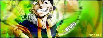
Just got bored today so decided to make a sig. Which I have not done in a while really.....managed to come up with this somehow. Suprisingly enough it actually is not a smudge 

meh.
-
For one.. Interesting sig. Your blending could use some work. (Mainly on the head, theres some noticable lines..) IMO, I don't like text that you can barely read.. I didn't even realise it was there for a sec.. try putting the opacity a bit higher.. Or duplicate the layer.. I don't know how you did that without smudging, because.. that looks like smudging. Nice work.
Second.. Children of Bodom FTW!
-
 Originally Posted by Outsider

text that you can barely read.. I didn't even realise it was there for a sec.. try putting the opacity a bit
That's sort of the point. I would rather have no text at all, but then there is the possibility of rippers slapping their names on it. Text is not supposed to be noticed, the image is supposed to be the focal point. Also I did not want to blend the render too much as it is a cartoon, cartoons have think black outlines and if you get rid of that then the render might look incomplete.
Last edited by SgtSwabs; 10-22-2006 at 10:24 AM.
-
Well, aside from those points.. good sig. Keep it up I s'pose.
-
Originally Posted by SgtSwabs
That's sort of the point. I would rather have no text at all, but then there is the possibility of rippers slapping their names on it. Text is not supposed to be noticed, the image is supposed to be the focal point. Also I did not want to blend the render too much as it is a cartoon, cartoons have think black outlines and if you get rid of that then the render might look incomplete.
There's a difference between insignificant and unreadable. That's probably an overstatement for this one though, it is readable, it just takes some effort. Trying to figure out what it says kinda takes attention away from the image. I'd say either make the text more readable while still maintaining the lack of emphasis, or make it so hidden that it isn't noticeable at all upon first glance, just enough so that you could point it out if it's ripped. And another thing, vertical text never looks good.
That's all a minor point though.
As for the rest, it's pretty cool, nothing amazing, I like how you repeated the orange and yellow from the stock in the background, but it looks unbalanced because of that, the right side has too much weight. Maybe it'd look better if you did a horizontal flip on the background layer(s) to balance it better, or have orange on both sides of the red, or have the orange in the middle and red surrounding it; just some possibilities to consider. Flipping the bg would correct the conflicting light sources though (the bg looks like the light is coming from the right, but the stock's lighting is from the left based on the shadows), so you should experiment with that.
 Posting Permissions
- You may not post new threads
- You may not post replies
- You may not post attachments
- You may not edit your posts
-
Forum Rules
|


 Reply With Quote