GFXVoid Graphic Design Forum

Remove Text Formatting
Loading...

» Online Users: 4,341

0 members and 4,341 guests
No Members online

» Site Navigation

 > FAQ

» Stats

Members: 35,443
Threads: 103,072
Posts: 826,684
Top Poster: cc.RadillacVIII (7,429)
Welcome to our newest member, Lekelindids
Results 1 to 4 of 4

Thread: Sig.

  1. #1

    Talking Sig.

    This is my second sig. tell me what you think

  2. #2
    Join Date
    Jun 2006
    Posts
    1,237

    Default

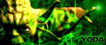
    For a second sig it's not too bad. The main thing I would do is make the render of yoda stand out more. Try not putting the background color over him and blending him in a little more. To blend, just smudge a bit all the way along its edge and then duplicate it and gaussian blur the bottom layer just a bit. Also, a little more variety in color would make it much better. Those are just a few tips, but again, that's pretty darn good for a second sig! Keep working and experimenting!


  3. #3

    Red face Which Sig. is better?

    Which one of these sigs do you think is better?


  4. #4
    Join Date
    Aug 2006
    Location
    Vancouver
    Posts
    4,948

    Default

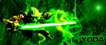
    Second one. The saber looks kinda funny in the top one. Maybe it's just too bright?

    You've definitley improved fast. My first few sigs, were, filter,render clouds, slap a render in, add some ugly text and call it a day. Well..sometimes I still do that, heh.
    Keep at it.


    Thanks.
    Prick.


Posting Permissions

  • You may not post new threads
  • You may not post replies
  • You may not post attachments
  • You may not edit your posts
  •  
Powered by vBadvanced CMPS v4.1.1