GFXVoid Graphic Design Forum

Remove Text Formatting
Loading...

» Online Users: 6,863

0 members and 6,863 guests
No Members online

» Site Navigation

 > FAQ

» Stats

Members: 35,443
Threads: 103,072
Posts: 826,684
Top Poster: cc.RadillacVIII (7,429)
Welcome to our newest member, Lekelindids
Results 1 to 4 of 4

Thread: New One

  1. #1
    Join Date
    Jan 2007
    Location
    Lost in Canada
    Posts
    9

    Default New One

    Did this For a battle in Superdudes
    C&C plz


  2. #2

    Default

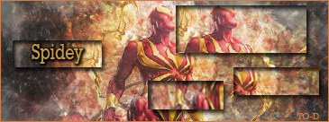
    i dont like the brushing, text, or the diagnol line effect...sorry i really dont wanna put you down but its just my opinoin...

  3. #3
    Join Date
    Dec 2006
    Location
    Pittsburgh PA
    Posts
    152

    Default

    yeah the diaganal effect can go, it doesn't fit the flow, but other than that i like it
    Throughout life advance daily, becoming more skillfull than yesterday, more skillfull than today...this is neverending...Hagakure


  4. #4

    Default

    Once again too messy. If that bright spot in the middle is supose to be it's focule point then that's a step forward.

Posting Permissions

  • You may not post new threads
  • You may not post replies
  • You may not post attachments
  • You may not edit your posts
  •  
Powered by vBadvanced CMPS v4.1.1