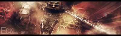
I like it, ALOT The text isnt eactly fitting, but it you be tough to find anything that would fit that sig. Amazing job
Fav: Newest:
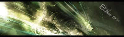
Pretty nice but I think it need a curves layer and maybe a contrast layer to make the colors more vibrant and help the render stand out more. Text needs some work as well too.
This is me.
Forum Rules


 Reply With Quote
![[PHXN] New001's Avatar](image.php?s=8a7389f6ad8bba37be6328a81d583012&u=7015&dateline=1264038258)
![Send a message via AIM to [PHXN] New001](http://www.gfxvoid.com/forums/images/misc/im_aim.gif)
![Send a message via MSN to [PHXN] New001](http://www.gfxvoid.com/forums/images/misc/im_msn.gif)
![Send a message via Yahoo to [PHXN] New001](http://www.gfxvoid.com/forums/images/misc/im_yahoo.gif)


