0 members and 340 guests
No Members online

» Site Navigation

» Stats
Members: 35,443
Threads: 103,072
Posts: 826,684
Top Poster: cc.RadillacVIII (7,429)
|
-
-

Work on the text. Less is usually more.
 Thanks.
Prick.
-
To be honest... These are horrible... Sorry man it seems like you did this in minutes... Any of the really GOOD things I've ever created took me an hour or 2 to make and then (possibly) days of tweaking it. The difference in your current signature and the one you're displaying almost disturbs me... And I also find it strange your name in nowhere to be seen on the current.
If you're trying to blend something, don't reduce it's opacity. What you should do instead; get the polygonal lasso tool and set the feather to 20. Then click a somewhat large square and drag the selection (with the polygonal lasso tool selected, NOT the arrow tool) around the image and press delete, it will delete some pixels and reduce the opacity of some pixels as it gets further away from the selection.
Last edited by Killer; 01-26-2007 at 12:34 AM.
-
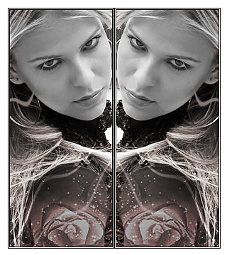
that makes sense...i'm beginning to shy away from adding my name to EVERYTHING i do...what's the point it's posted under me so most people know i did it...oh and my current and this one took the same amount of time...usually only takes a half hour to an hour to make a good sig...just like with drawing time does not dictate quality u know :-) thanks for the cratique you're right this is diffanantly not my best
Throughout life advance daily, becoming more skillfull than yesterday, more skillfull than today...this is neverending...Hagakure
-
I think adding your name to anything you make is pretty much standard. Even if you lower the opacity of your name to even 5% or so...it's watermarked to prevent someone claiming it is their own.
Here's an example.
Bottom right it says DM. Opacity is at 15% I think.
Thanks.
Prick.
-
 Originally Posted by Dark Method

I think adding your name to anything you make is pretty much standard. Even if you lower the opacity of your name to even 5% or so...it's watermarked to prevent someone claiming it is their own.
Here's an example.
Bottom right it says DM. Opacity is at 15% I think.
i think i might be retarded cuz i dont c n e text
-
Thanks.
Prick.
-
I can't see it either <_<....>_>
-konfusion
-
*strains eyes*....... *burts blood vessles*........ *gives up*
anyway, i think the sig is ok, not great. i think its just really really different from the normal, and not made all that well.
the first part means its a GOOD thing, im bored of seeing the same slap a sig on some brushed background, slap a border on,
originality is very imortant part of a sig as far as im concerned.
the second part is obviously bad. you need to spend more time making your sig, 2 - 3 hours is good, then walk away and do something else so the image is out of your head, then come back and look at it from a fresh perspective. and if it looks shit, fix it.
p.s. if i ever ever ever see another halo sig, people will die.
-
lol manos thanks for the feed back everyone...but just another thing about adding names...i assume that everyone on here know's how to use photoshop, so if someone steals my stuff and says it's theres even thought i have a water mark or my name or something it can be removed pretty easily, and another name added...name doesn't mean much to me, nor do i really care if someone steals and claims my stuff, i know who did it and that's all the matters...name's don't matter much unles they're relly cool like mannos' name :-)
PS i don't see the water mark either...i tried the "Magic Eye" technique n i used 3d glasses just in case...No luck, but i do believe you :-)
Last edited by Graffight; 01-26-2007 at 09:35 PM.
Throughout life advance daily, becoming more skillfull than yesterday, more skillfull than today...this is neverending...Hagakure
Similar Threads
-
By Riddleb0x in forum Sigs & Manips
Replies: 2
Last Post: 01-19-2007, 03:12 PM
-
By zimmer92 in forum Sigs & Manips
Replies: 14
Last Post: 01-16-2006, 04:01 PM
-
By McStarken in forum Sigs & Manips
Replies: 3
Last Post: 01-05-2006, 12:57 PM
-
By DaLe2005 in forum Sigs & Manips
Replies: 6
Last Post: 12-30-2005, 05:26 AM
-
By sofa in forum Sigs & Manips
Replies: 7
Last Post: 12-11-2005, 07:12 PM
 Posting Permissions
- You may not post new threads
- You may not post replies
- You may not post attachments
- You may not edit your posts
-
Forum Rules
|


 Reply With Quote


