0 members and 2,545 guests
No Members online

» Site Navigation

» Stats
Members: 35,443
Threads: 103,072
Posts: 826,684
Top Poster: cc.RadillacVIII (7,429)
|
-
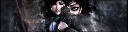
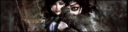
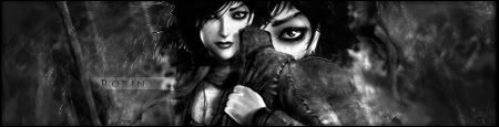
 exploring color exploring color
ok, I really like this one. render is one of the characters from Dreamfall. Also, this is like the first time I've posted different color choices because I honestly can't make up my mind on which one I like best.
v1
v2
v3

If everyone cared and nobody cried...
If everyone loved and nobody lied...
If everyone shared and swallowed their pride...
Then we'd see the day that nobody died...
noobdesign.net ftw
-
-
-
-
 Originally Posted by reymizzle

gewd shit.
I Love Spam!
Anyway, I realy like the colors on the first one, but they seem to flow better on the second. The third one is just... garbage. Not to be mean of course. Just the lack of color makes it horrible.
Also, your text isn't that good. Don't use those little text bar line things, just find somewhere where you can put your text without it being lost in the background. Those text bar things are horrible.

----------------------------------------------

-
I like it in general, besides the fact that you could maybe crop off a bit on the left and on the right.
2nd one's the best!
-konfusion
-
-
The second one looks great to me, it's just too wide, gj! 
Similar Threads
-
By wangzta in forum Sigs & Manips
Replies: 4
Last Post: 02-24-2006, 05:46 AM
-
By Samuel in forum Digital Art
Replies: 4
Last Post: 01-22-2006, 05:03 AM
-
By Krimsyn in forum Digital Art
Replies: 15
Last Post: 07-28-2005, 05:52 PM
 Posting Permissions
- You may not post new threads
- You may not post replies
- You may not post attachments
- You may not edit your posts
-
Forum Rules
|


 Reply With Quote
![[PHXN] New001's Avatar](image.php?s=463f5163006dc81a564aa6725c8ba13b&u=7015&dateline=1264038258)
![Send a message via AIM to [PHXN] New001](http://www.gfxvoid.com/forums/images/misc/im_aim.gif)
![Send a message via MSN to [PHXN] New001](http://www.gfxvoid.com/forums/images/misc/im_msn.gif)
![Send a message via Yahoo to [PHXN] New001](http://www.gfxvoid.com/forums/images/misc/im_yahoo.gif)


