0 members and 5,113 guests
No Members online

» Site Navigation

» Stats
Members: 35,443
Threads: 103,072
Posts: 826,684
Top Poster: cc.RadillacVIII (7,429)
|
-
 My Latest Sig-CnC please? My Latest Sig-CnC please?
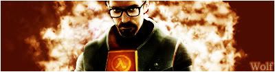
Well as some of you guys know l have started to step out of the monotone phase and im still adapting so today l made this and wanted to know what you guys think.Thanks guys 
-
i dont like the font you used to be honest. Thats the only problem i see
-
looks good. just change the font and the border colour do something dark
-
wow love te fire and i love the light on his back ..looks great they are right but your getting better with text, great job wolf.
 My DevART
RATCHET is my bitch
Andrew says:
u ever stolen a bible?
Apathy says:
no
used the last two pages to roll a joint though
Andrew says:
wow
thats fucking hard core
^^HAHAHA, dm sucks XD
-
This is made from one of the tuts here, right?
How did you make that fire bg?
-
 Originally Posted by Notorious

This is made from one of the tuts here, right?
How did you make that fire bg?
I clicked my fingers and it was created lol just look around and experiment.Thanks for the comments guys.Other people feel free to leave feedback
-
i think this is one of your best though have you sharpened the area around his nose or is that how the render looks? and your getting better with your text and the bg looks awesome. GJ
-
This is definitely one of your best. The left side of the firey BG is better than the right imo, the left seems more free. The text isn't bad, and you just need a 1px black border and you're set.
XBOX Live Gamertag: Merc 106

-
l agree Shadow thanks for the feedback btw wth is imo? and add me on aim if you like
-
XBOX Live Gamertag: Merc 106
Similar Threads
-
By Sp0rk-eh in forum Sigs & Manips
Replies: 8
Last Post: 12-13-2005, 07:27 PM
-
By AntidotexXx in forum Sigs & Manips
Replies: 6
Last Post: 11-25-2005, 06:38 AM
-
By dmiller in forum Sigs & Manips
Replies: 2
Last Post: 11-24-2005, 11:58 AM
-
By LazerAce7 in forum Sigs & Manips
Replies: 3
Last Post: 11-21-2005, 09:13 AM
 Posting Permissions
- You may not post new threads
- You may not post replies
- You may not post attachments
- You may not edit your posts
-
Forum Rules
|


 Reply With Quote


