GFXVoid Graphic Design Forum

Remove Text Formatting
Loading...

» Online Users: 3,566

0 members and 3,566 guests
No Members online

» Site Navigation

 > FAQ

» Stats

Members: 35,443
Threads: 103,072
Posts: 826,684
Top Poster: cc.RadillacVIII (7,429)
Welcome to our newest member, Lekelindids
Results 1 to 10 of 10

Thread: Problematic

  1. #1
    Join Date
    Dec 2006
    Posts
    1,270

    Default Problematic


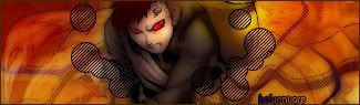
    I compared them before switching comps, and on one comp it looks just right
    and the other looks overly contrasted. I think I'm going to take pictures so I can compare them to you :P
    Fav:


    Newest:


  2. #2
    Join Date
    Jan 2007
    Location
    Minnesota
    Posts
    5,091

    Default

    i like it alot, and the bg is great. imo it would be cooler if u put the font over on the other side.


    My DevART
    RATCHET is my bitch
    Andrew says:
    u ever stolen a bible?
    Apathy says:
    no
    used the last two pages to roll a joint though
    Andrew says:
    wow
    thats fucking hard core
    ^^HAHAHA, dm sucks XD


  3. #3

    Default

    is that ashley tisdale
    ?????/

  4. #4
    Join Date
    Dec 2006
    Posts
    1,270

    Default

    Yeah bro.
    Shes alot hotter now. Liek If you've ever watched the Suite Life, I think ull agree she looks alot better in this pic :P
    Fav:


    Newest:


  5. #5
    Join Date
    May 2006
    Location
    Canada
    Posts
    556

    Default

    seems kinda orangy contrast, but the left side is empty


  6. #6
    Join Date
    Jan 2007
    Location
    Sydney
    Posts
    136

    Default

    omg awesome you made a larger sig for one congrats!=P Jokes l like it heaps man gj

  7. #7
    Join Date
    Jan 2007
    Location
    Sydney, Australia
    Posts
    259

    Default

    i like it heaps i like the circles youv'e made and GJ

  8. #8
    Join Date
    Jun 2005
    Location
    Gosport England
    Posts
    1,335

    Default

    a little too much empty space on the left ..maybe make it a bit smaller

  9. #9
    Join Date
    Dec 2006
    Posts
    1,270

    Default

    I'd love to make it smaller
    Any other CnC?
    Fav:


    Newest:


  10. #10
    Join Date
    Jun 2006
    Posts
    626

    Default

    looks really good, i like the circles. one thing though, could you play about with her skin colour? she looks like she fell asleep on a BBQ

Posting Permissions

  • You may not post new threads
  • You may not post replies
  • You may not post attachments
  • You may not edit your posts
  •  
Powered by vBadvanced CMPS v4.1.1