0 members and 8,012 guests
No Members online

» Site Navigation

» Stats
Members: 35,443
Threads: 103,072
Posts: 826,684
Top Poster: cc.RadillacVIII (7,429)
|
-
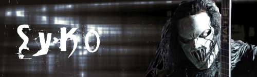
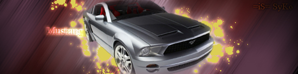
 Slipknot Slipknot
I haven't done a sig in a while so I decided to try some today.

-
The first thing I see is big text! Read this dude.
http://www.gfxvoid.com/forums/showth...046#post202046
Not liking the animation much, but that's nothing personal. I don't like animation in sigs period.
I think you need some colour in them too. Keep at it though.
 Thanks.
Prick.
-
Thanx for the input. Ill remember that 4 next time 
-
i gotta agree with dark method but im liking the sigs just for the fact that it has Slipknot. so gj
 My DevART
RATCHET is my bitch
Andrew says:
u ever stolen a bible?
Apathy says:
no
used the last two pages to roll a joint though
Andrew says:
wow
thats fucking hard core
^^HAHAHA, dm sucks XD
-
 Originally Posted by paparoksguitar

i gotta agree with dark method but im liking the sigs just for the fact that it has Slipknot. so gj
Nu.......Metal......corperate.....mainstream.....s lime...
Anyway! The sigs (and the text) are a bit too large, and due to the depthless animation the renders are not blended. Sooo...not bad, keep trying.
-
for that style the text is just fine. arial, times, ect. wouldn't look good. it just needs to be toned down, a lot. keep in mind that the main focus of the sig is the stock (in this case) so you don't want the text to draw attention away from it. at the same time though it has to be readable.
for your sigs, the animation doesn't really seem to serve much purpose, just two backgrounds switching back and forth. and again, takes away from the stock by taking too much attention. the animation thing can be done and look good, but you'd want it to be more subtle if you're not animating the stock. they're also quite big, I go with a width somewhere in the 300s, but it's personal preference. keep at it, I see that the text in your current is pretty much perfect.
-
-
swabs, stop being so snotty about music, every post Ive read by you recently has been critising music tastes.
nice work, sweet animations, just might wana size the sigs down a bit.
-
Originally Posted by paparoksguitar
i gotta agree with dark method but im liking the sigs just for the fact that it has Slipknot. so gj
same here and new album in 08 Woot!
-
SLipknot
Originally Posted by Riddleb0x
same here and new album in 08 Woot!
Nice can't wait dude.
My DevART
RATCHET is my bitch
Andrew says:
u ever stolen a bible?
Apathy says:
no
used the last two pages to roll a joint though
Andrew says:
wow
thats fucking hard core
^^HAHAHA, dm sucks XD
Similar Threads
-
By jerner in forum Digital Art
Replies: 15
Last Post: 03-25-2005, 05:23 AM
 Posting Permissions
- You may not post new threads
- You may not post replies
- You may not post attachments
- You may not edit your posts
-
Forum Rules
|


 Reply With Quote


