GFXVoid Graphic Design Forum

Remove Text Formatting
Loading...

» Online Users: 7,751

0 members and 7,751 guests
No Members online

» Site Navigation

 > FAQ

» Stats

Members: 35,443
Threads: 103,072
Posts: 826,684
Top Poster: cc.RadillacVIII (7,429)
Welcome to our newest member, Lekelindids
Results 1 to 8 of 8

Thread: My latest few..

  1. #1
    Join Date
    Feb 2005
    Posts
    31

    Default My latest few..

    So i havent posted here in awhile...if at all. I cant remember if i had posted before i lost my net or not..but yeah. Heres a few that i did over that time, and i'd like to know what you think...


    This one was actually going to be a series of vertical banners made from art my friend did..but alas i no longer have the images, and neither does he due to a computer crash.


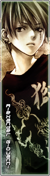
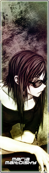
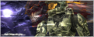
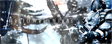
    These four were made for an Rp i had joined up on, and was bored one night. So i made up these simple ones...a pity the Rp never lasted long.


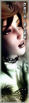
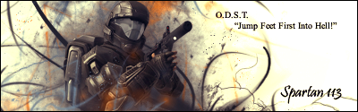
    Made for another Rp site i was apart of. Text sucks...i always seem to have a problem with text.


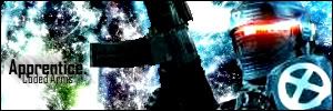
    Made for my new Gamertag on Xbox live..


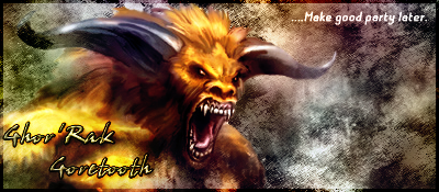
    This is my latest and newest work...made for my clan forums for Battlefeild 2142...which im quite obsessed with as of late.


    But yeah..there you are. Tell me what you guys think.
    Thanks!
    .:Latest:.


  2. #2
    Join Date
    Oct 2006
    Location
    Massachusetts, USA
    Posts
    688

    Default

    The vertical ones are better than the horizontal imo, but they're all good. My favorite one is the "Lust" vertical one, and my second fav. is the second one in the series of 4 vertical ones you have.

    XBOX Live Gamertag: Merc 106


  3. #3

    Default

    I agree with shadow.
    The brushing is pretty sweet on all of them . try using default fonts they work well sometimes with just a plain color.
    Latest Sig:;

    Best time sig:;

  4. #4
    Join Date
    Apr 2006
    Posts
    91

    Default

    I really like the background brush work that you do and how you composed the renders in your work, very nice. I don't know if I'm fond about the font on some of the horizontal ones, I do although really like the effect on "Halloween Night" in the last horizontal sig. Good job! ^ ^

  5. #5
    Join Date
    Oct 2006
    Location
    Sweden
    Posts
    221

    Default

    the vertical sigs looks good I like the first and the last one of them.. gj =)
    [
    -
    ]


  6. #6
    Join Date
    Aug 2006
    Location
    Vancouver
    Posts
    4,948

    Default

    I'm very impressed with your first one. Seems you have some good talent there. Too bad you lost the rest of the images. It would have made a nice piece I think.


    Thanks.
    Prick.


  7. #7
    Join Date
    Feb 2005
    Posts
    31

    Default

    Thanks for the comments guys.
    I personally like the vertical ones i did, and my new BF2142 sigs the best.

    I'm going to try and see if i saved the rest of the images that came with 'Lust', if im lucky enough i'll have em saved to a cd somewhere in my collection.

    If i do, finishing that project will be my first thing on my list.

    Thanks again for the comments guys! Means alot to me.
    .:Latest:.


  8. #8
    Join Date
    Dec 2006
    Posts
    1,270

    Default

    Yup, the Halo one doesnt quite fit
    But WOW the other ones are beast on wheels... great job

    The seem quite flawless aswell. Very good job
    Fav:


    Newest:


Similar Threads

  1. Latest
    By CrazyGamer in forum Sigs & Manips
    Replies: 5
    Last Post: 12-15-2005, 12:51 AM
  2. Latest.
    By Sp0rk-eh in forum Sigs & Manips
    Replies: 8
    Last Post: 12-13-2005, 07:27 PM
  3. The latest sig...
    By AntidotexXx in forum Sigs & Manips
    Replies: 6
    Last Post: 11-25-2005, 06:38 AM
  4. my latest
    By dmiller in forum Sigs & Manips
    Replies: 2
    Last Post: 11-24-2005, 11:58 AM

Posting Permissions

  • You may not post new threads
  • You may not post replies
  • You may not post attachments
  • You may not edit your posts
  •  
Powered by vBadvanced CMPS v4.1.1