0 members and 5,816 guests
No Members online

» Site Navigation

» Stats
Members: 35,443
Threads: 103,072
Posts: 826,684
Top Poster: cc.RadillacVIII (7,429)
|
-
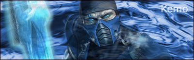
 RP,,,,,,great lighting RP,,,,,,great lighting

Only brushed use were the splatter on left, rest done by myself, look better on a dark backround
-
i like it, except for the text and it's too big for my taste. does look better on a dark bg.
what's the bg btw? just brushes?
Last edited by Jeff; 03-10-2007 at 04:40 PM.
-
Text throws it of..Other than that nice job..
-
nice sig. lighting is good though that text font doesn't suit it that much. other than that looks cool
Fav:

 Originally Posted by kemo

Kemo_is_god: shutup sic.sick
sic.sick6: oh noes... i must shuttup! kemo's mighty servant hath spoken...
-
Originally Posted by jsoosiah
what's the bg btw? just brushes?
Says only brushing was the splat.
Nice job man.
Yeah, I'd have to agree that the text sorta throws it off, but other than that, awesome!
-
im sorry but i have to disagree with the rest of you guys...i think the text is right on the money with this one. im usually more for basic fonts and subtle effects on text but i think he did a bang up job.
-
I agree with Wrench, the text fits perfectly. I love the BG, the effects you put on, and the game was great too lol
XBOX Live Gamertag: Merc 106

-
very nice effects. i love the lightbeams, although they could be cleaned up a bit more. and the text is perfect for the image
-
Heh, what was that game? Looks like star wars... Commandos or something?
-
Looks nice, but please do something about the text.
Similar Threads
-
By robgasm in forum Resources
Replies: 12
Last Post: 02-04-2006, 11:59 AM
 Posting Permissions
- You may not post new threads
- You may not post replies
- You may not post attachments
- You may not edit your posts
-
Forum Rules
|


 Reply With Quote