


since I'm new here's my stuff
mostly sigs
first Sig ever
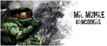
halo
flcl
v for vendetta
av
bond v1
bond v2
halo
more halo
user bar
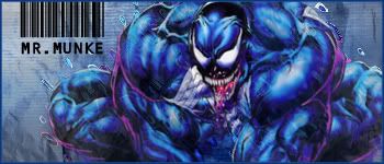
venom
SW trooper
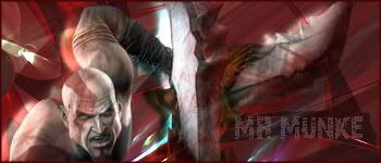
god of war
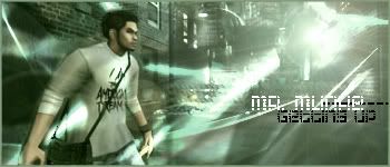
getting up
next door Nikki
clerks II
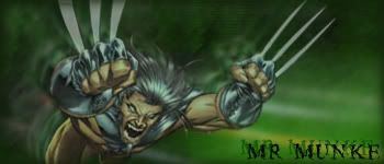
wolverine
|
|


Loading...
|
» Online Users: 1,595
|
Results 1 to 3 of 3
Thread: here's my shit
Similar Threads
|


 Reply With Quote